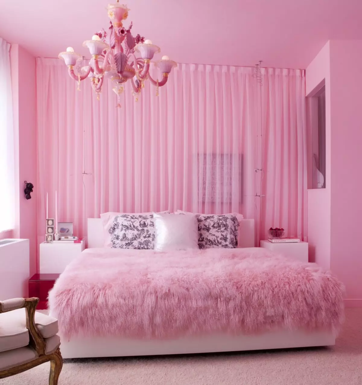
Pink color in the interior is one of the most winning indoors. Stereotypes impose an idea that the room, the interior of which is designed in pink colors, is suitable only for Barbie's doll, tanned blondes a la Paris Hilton or lovers of sweets, dreaming of living in a gingerbread house. That is why many try not to use pink color in the interior, not wanting to seem like frivolous and immature.
Nevertheless, if you distracted from advertising or advertising images, you can see that the variety of shades, from light to dark pink and the ability to combine it with the most different colors allows you to make a room with light, fresh and positive, and sometimes even sophisticated and elegant.
Pink value in the interior
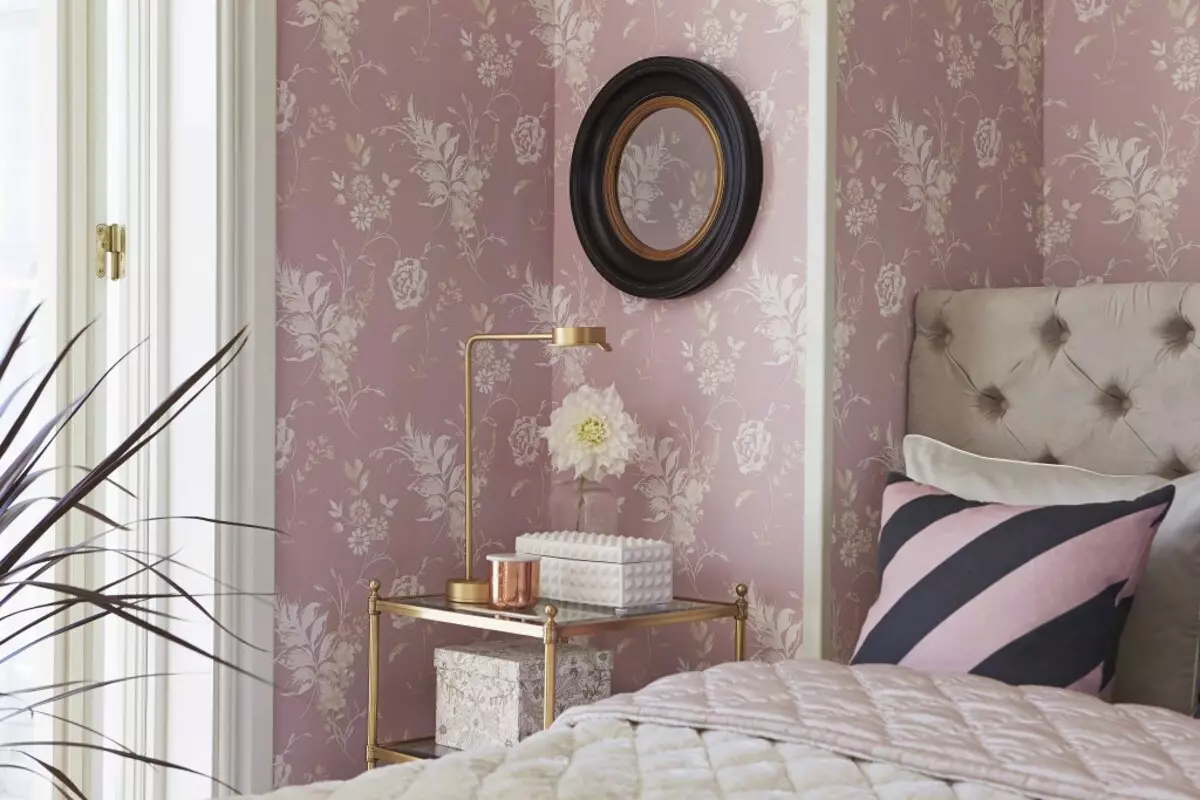
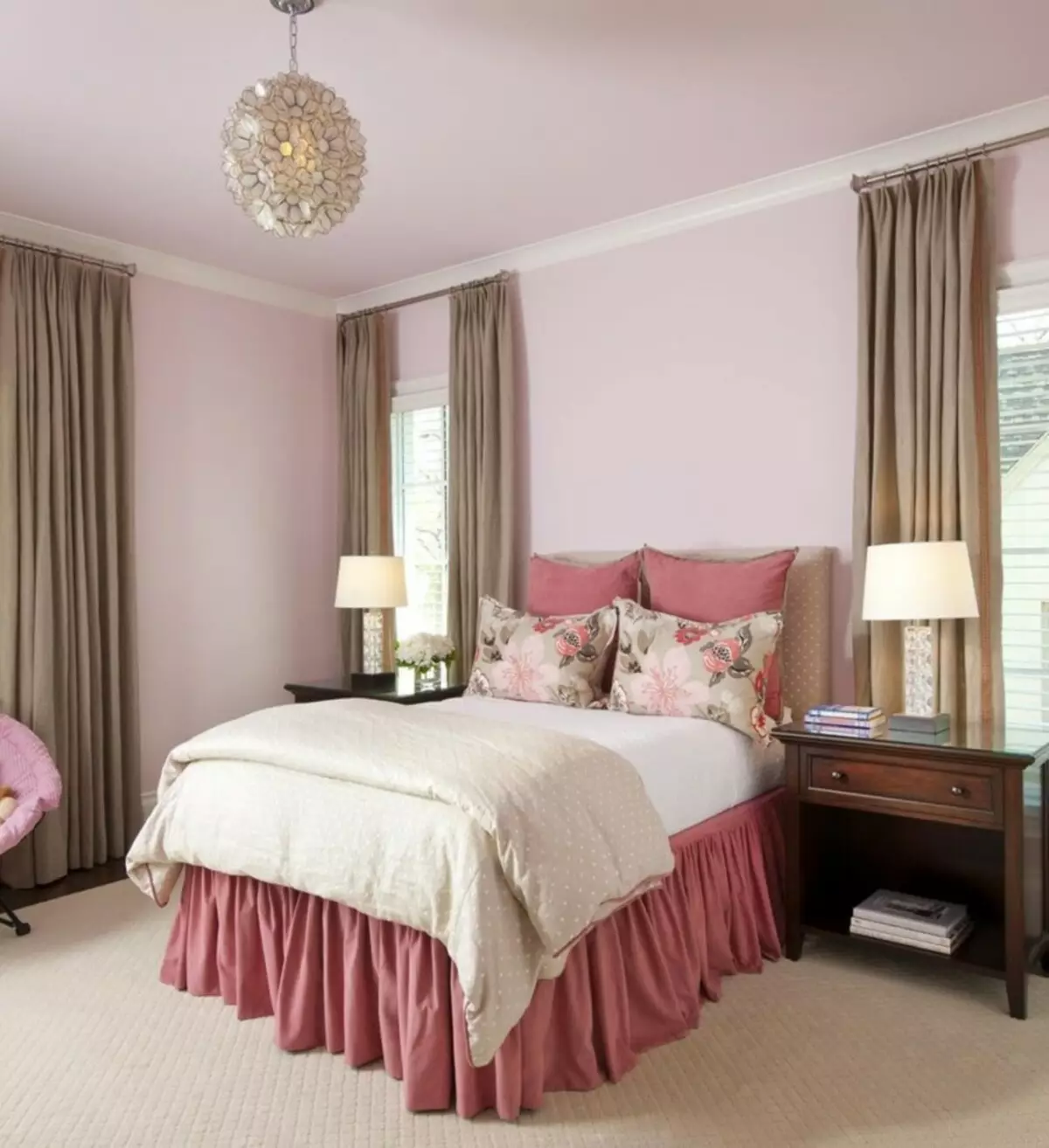
From a psychological point of view, the value of pink - friendliness, maturity, femininity. On the other hand, for many, it means windiness, frivolity. In the interior of the bedroom or living room shades of light pink means tenderness, femininity, and brighter - passionism, selflessness, kindness.
Considerable value color has in medicine. In the color therapy, such a color of the walls is used to restore, it contributes to a faster cell regeneration and improves the mood and fills the energy.
Several rules for using pink
The pink interior gives ample opportunities for the manifestation of its taste. It is enough to remember a few simple rules for use:
- Use of optical illusions. With the help of paints, it is possible to make furniture objects or other interior details more voluminous and light. If you paint one of the walls in a light pink color, the room will become spacious, and the ceiling is higher. A sofa or table painted in light lilac will look more than in fact, but they will not seem massive. This effect is suitable for the walls of the bathroom or a small bedroom.
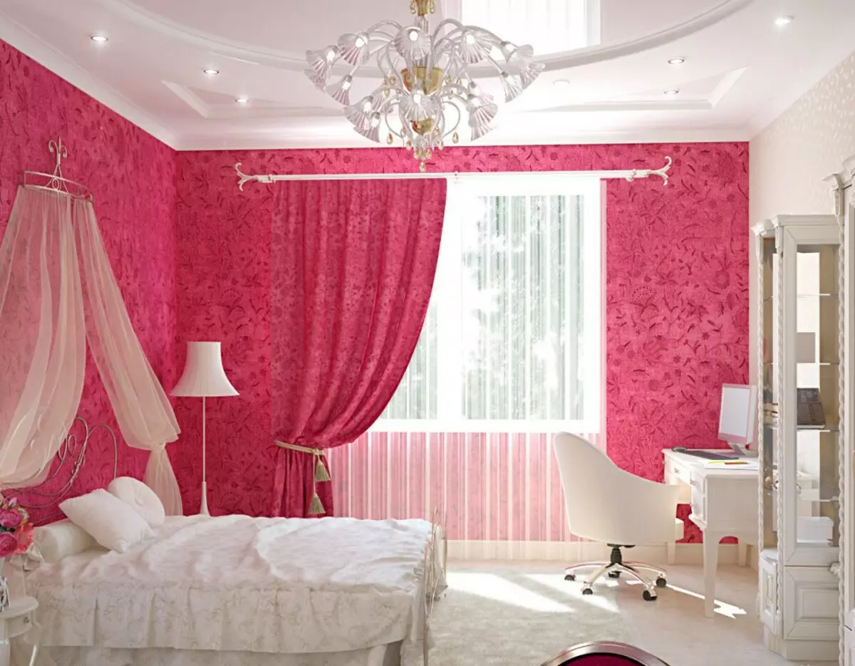
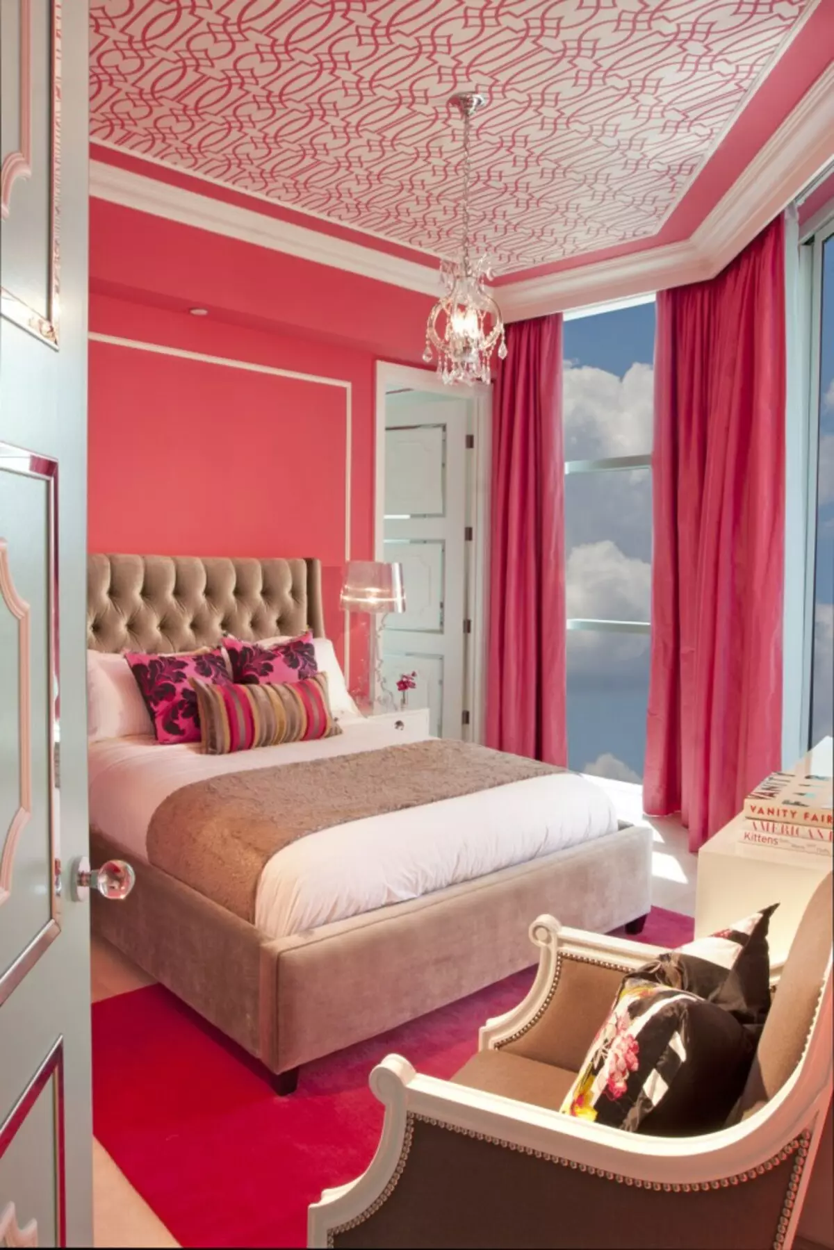
- Colorful temperature. There are many shades of pink: warm dark pink and coral red, cold gray-pink, lilac and lavender. The warm color (peach, salmon, tea rose) will make the room more cozy and bright, and the cold shades of the walls of bright and gray-pink (fuchsia, crimson, Majer) will raise the mood and fill the energy.
Article on the topic: In what color to paint the ceiling: basic rules, important moments
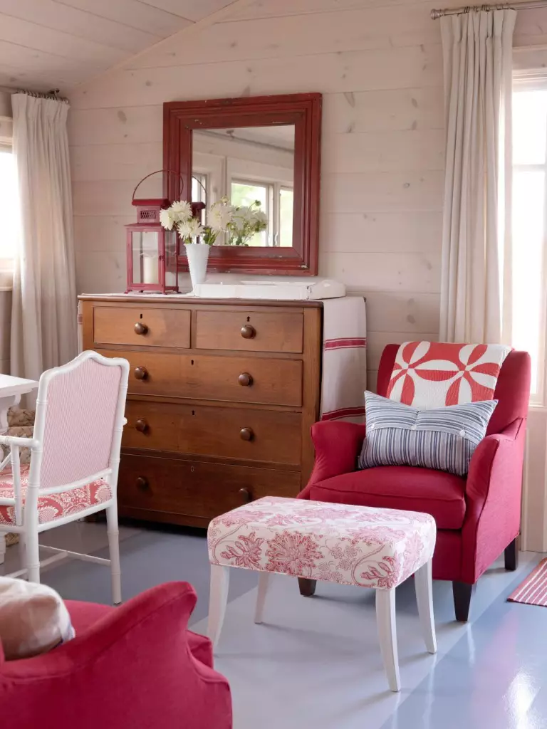
- Combination. Whatever shade you have chosen, do not forget that completely fulfilled even in a muted gray-pink room will hinder the eye. Correct gray, brown, yellow, green, turquoise with pink. Bright and dark pink shades are better to choose for individual settings that will attract attention. To dilute dark pink, use white, beige, pale lilac colors.
- Watch out the style. Pink in combination with other bright colors. Black, white, turquoise, orange - all this perfectly suits pop art or retro style. Bright shades will decorate the interior in the Scandinavian style, and muted and soft gray-pink tones emphasize the charm of the bedroom or bathroom in a romantic or classic style.
- Observe the measure. Moderation is a guarantee of a good interior. Do not use too many different colors, have enough two main shades and one as an accent. Choosing several different shades for one room, make sure that they are combined with each other. Coral and lilac can be not the best idea even for the bathroom.
Pink in the setting of different rooms
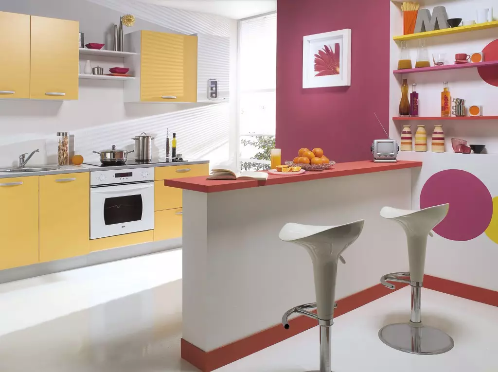
Competently used color of the walls can decorate any room in the apartment. Of course, most often it is used for children's rooms, bedrooms, less often - living room, bathroom, kitchens. If you want to make the kitchen brighter and positive, pink color in the interior of the kitchen can help you in solving this task. However, first make sure that all the inhabitants of the apartment will suit such a color solution. As a compromise, you can choose a lilac or gray-pink.
Pink has the ability to stimulate appetite that it is not better suitable for rooms such as kitchen and dining room.
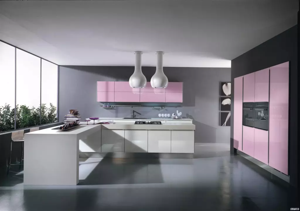
This applies, above all, to bright shades - crimson, fuchsia, etc. Together with the appetite, they strengthen and emotions. Therefore, if you want to create a calm, peaceful atmosphere in the kitchen, it is better to choose a pastel-lilac and smoky-pink.
Article on the topic: In what color to paint the walls: a combination and nuances (+40 photos)
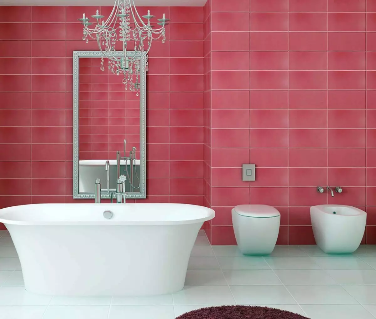
Interesting the use of pink and bathroom. Warm and rich shade in this case is recommended only to particularly romantic agents and fans of this color. In other cases, we advise you to stop your choice on the lungs, light pink shades. They visually expand the space even not the most spacious bathroom, make it more comfortable and pleasant. Choosing paints, do not forget that all family members use the bathroom, which means you first need to ask if their bathroom style arranges in pink colors.
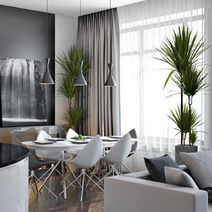
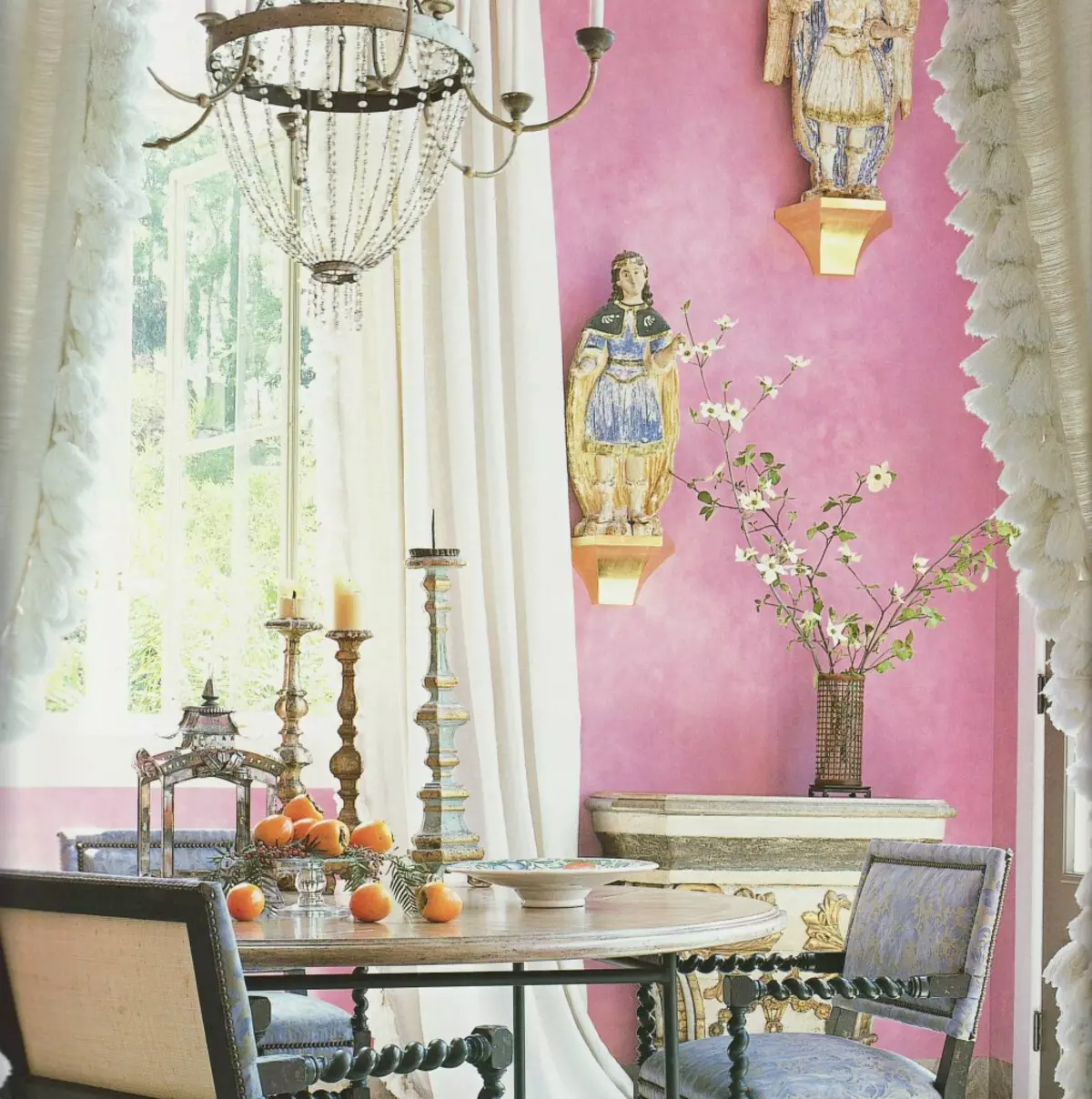
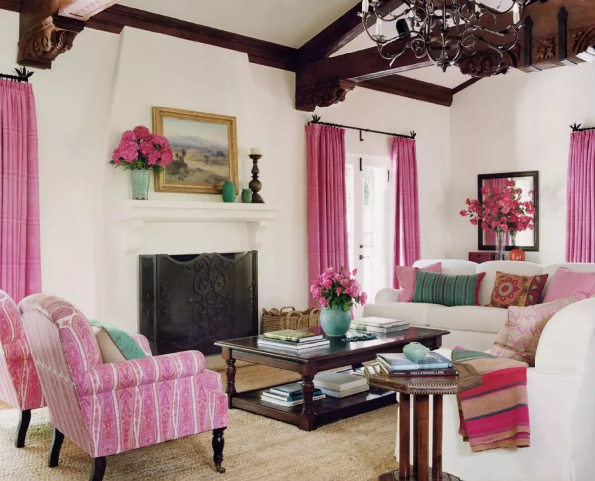
In the interior of the living room or bedroom it all depends on your taste and fantasy. The main thing is that the selected palette does not tired eyes and is not tired too quickly. In the living room you can use bright colors, and it is better to prefer gray-pink and pastel shades for the bedroom.
Combination with other colors
Due to the manifold of shades, it is possible to combine it almost with any other color.
Most successfully watch the combination of pink with flowers as:
- brown;
- yellow;
- green;
- grey;
- beige;
- turquoise;
- lilac;
- white;
- the black.
Bright combinations
Bright, rich and positive combinations gives pink and yellow, green, turquoise.
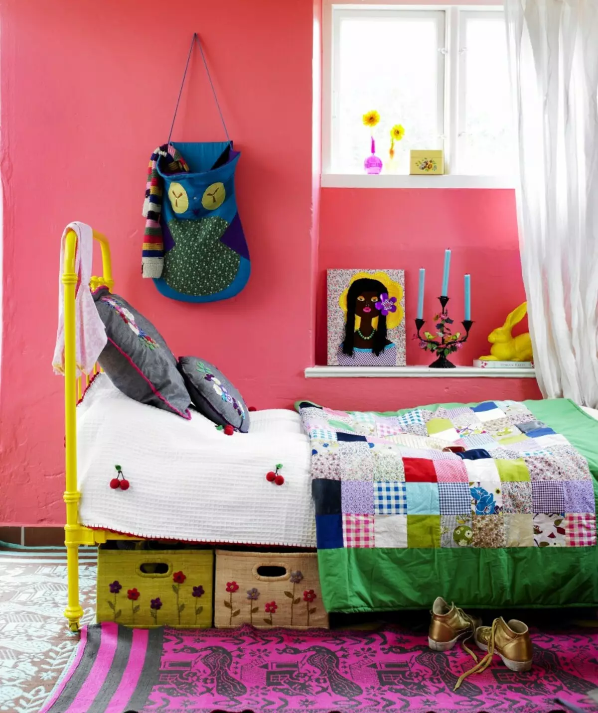
Pink and yellow - bright, positive combination. Yellow in this combination will be an excellent solution for children's, kitchen or living room. Yellow, like pink, combines with many colors, which allows you to create a joyful, positive and filling the design of the room. Yellow will make a room less doll, while retaining the ease and sense of the holiday.
Yellow is combined with all the "children's" flowers, which makes it a very successful combination for the kid's room.
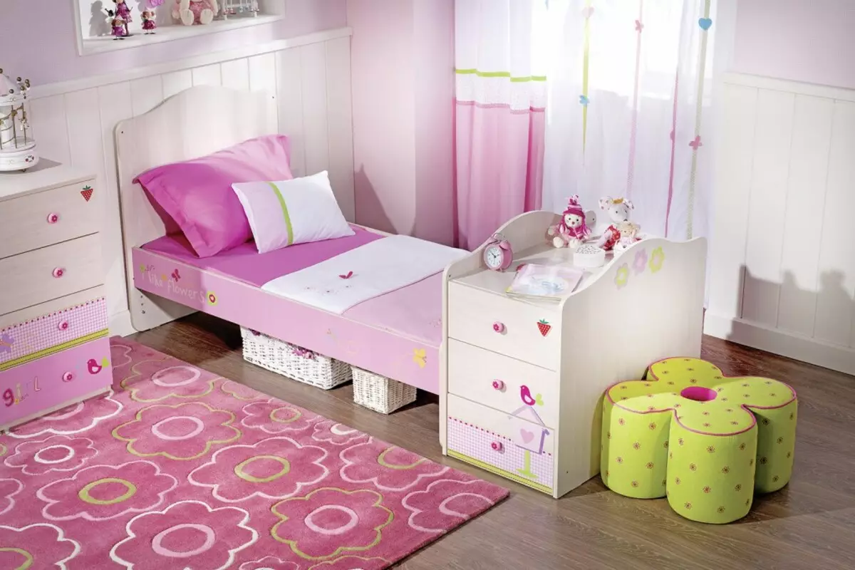
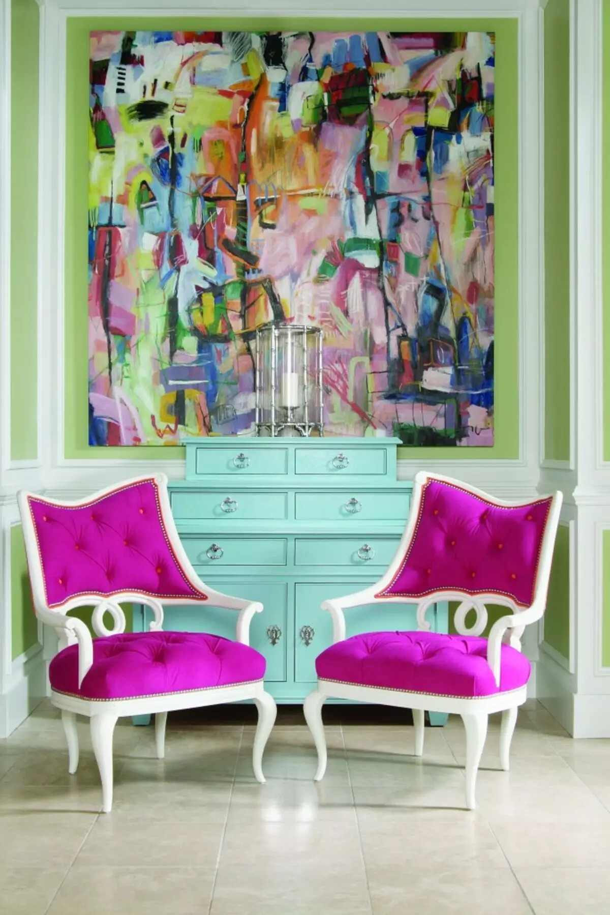
Fresh spring atmosphere will create a combination of pink + green. This is an excellent choice for the kitchen, dining room or living room. Green reminds about flowering meadows or blooming in spring kidneys. Despite the unusual combination, it can become successful for a bedroom or a girl room. Green deprives his pink frivolousness, making the interior stylish, bright and extraordinary. Green with pink usually complements neutral white color.
Turquoise and lilac or pink is a very common combination of colors for walls in the West. Turquoise color is suitable for bright, children's room, especially if children live in her various sexes. Pink-turquoise creates a good mood, fills the energy, but it is necessary to use such colors carefully, so as not to cause an overexcitation child.
It is best to dilute a bright turquoise neutral white or choose furniture color of light wood.
Restrained combinations
Calm, restrained colors are obtained with a combination of pink + brown, beige, gray. Pink and brown create a wonderful contrast of dark and light. In addition, this "delicious" combination resembles chocolate with strawberries or other sweets. Strict and gloomy gray-brown come to life under the influence of pink. Brown background perfectly highlights pink furnishings, helps to express accents in the room. Pink and brown often complement such colors as white, beige, cream, blue or light green. This combination is suitable for the bedroom or living room, and if the brown is moderately used, even even for the nursery.
Article on the topic: Determine the colors for the walls: the combination and features of the choice
Gray in combination with gray-pink creates an elegant, discreet and refined combination. The noble gray is perfectly combined with metal and mirror surfaces. Calm gray can be revived with bright pink accessories. Gray is characterized in that it combines almost any shade of pink walls.
The pink gray interior looks stylish and expensive, suitable for living room, dining room and other rooms.
Beige and pastel pink - gentle, feminine and pleasant combination. Beige dilutes the interior from the shockful sweetness, it is suitable for the children's, adult woman or teenage girl bedroom. Beige makes room warm, cozy and calm. A particularly successful combination when beige is used for painting opposite walls. Beige well combined with light wooden furniture.
Video Gallery
Photo Gallery


