During the repair of the dwelling, the question arises in which color to arrange a room or another. Often the choice drops on green. He has many shades, so it can be embedded in almost any interior style. Green is a natural color, so it is pleasant to the eye, peacefully affects the psyche. How to choose a green shade and use it for the design of residential space?
Green shade
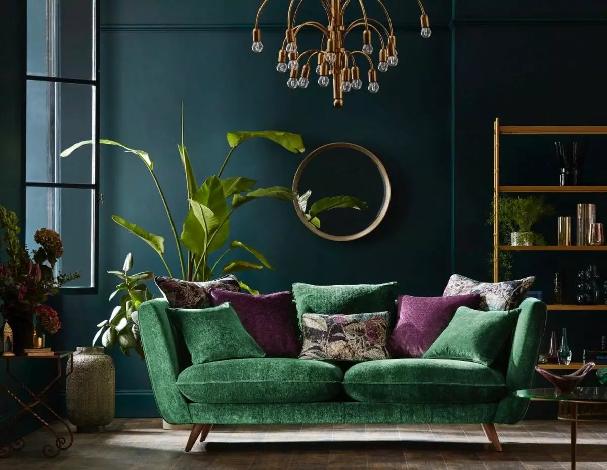
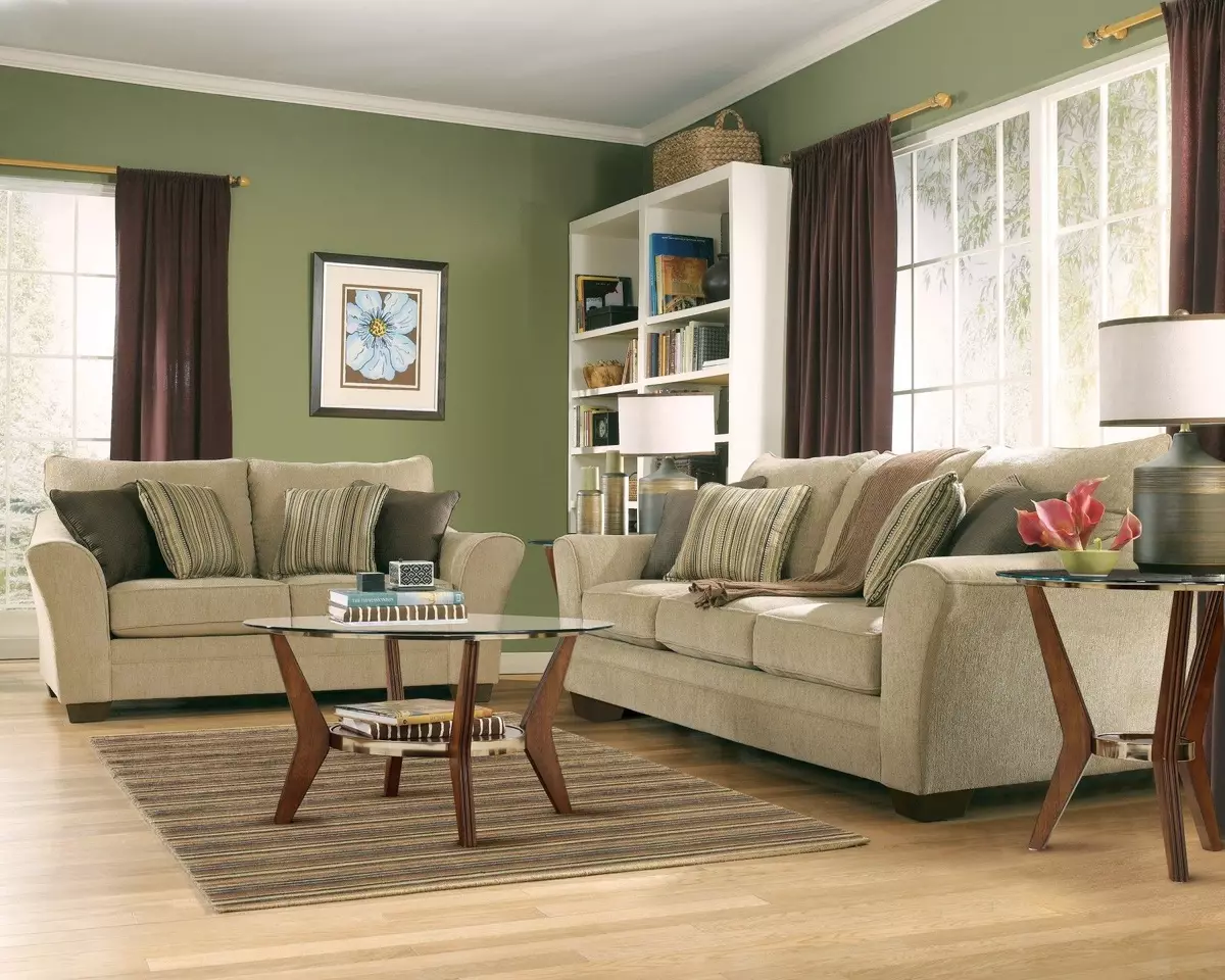
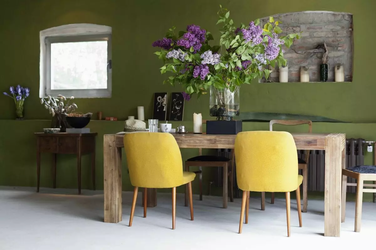
This color can still be called forest green. In nature, dark green there are algae, some herbs, coniferous trees. This shade cannot be dominant in the interior, however, it is possible to competently arrange accents and emphasize the personality of the dwelling. Dark green colors look good in the design of the living room, bathroom, hallway.
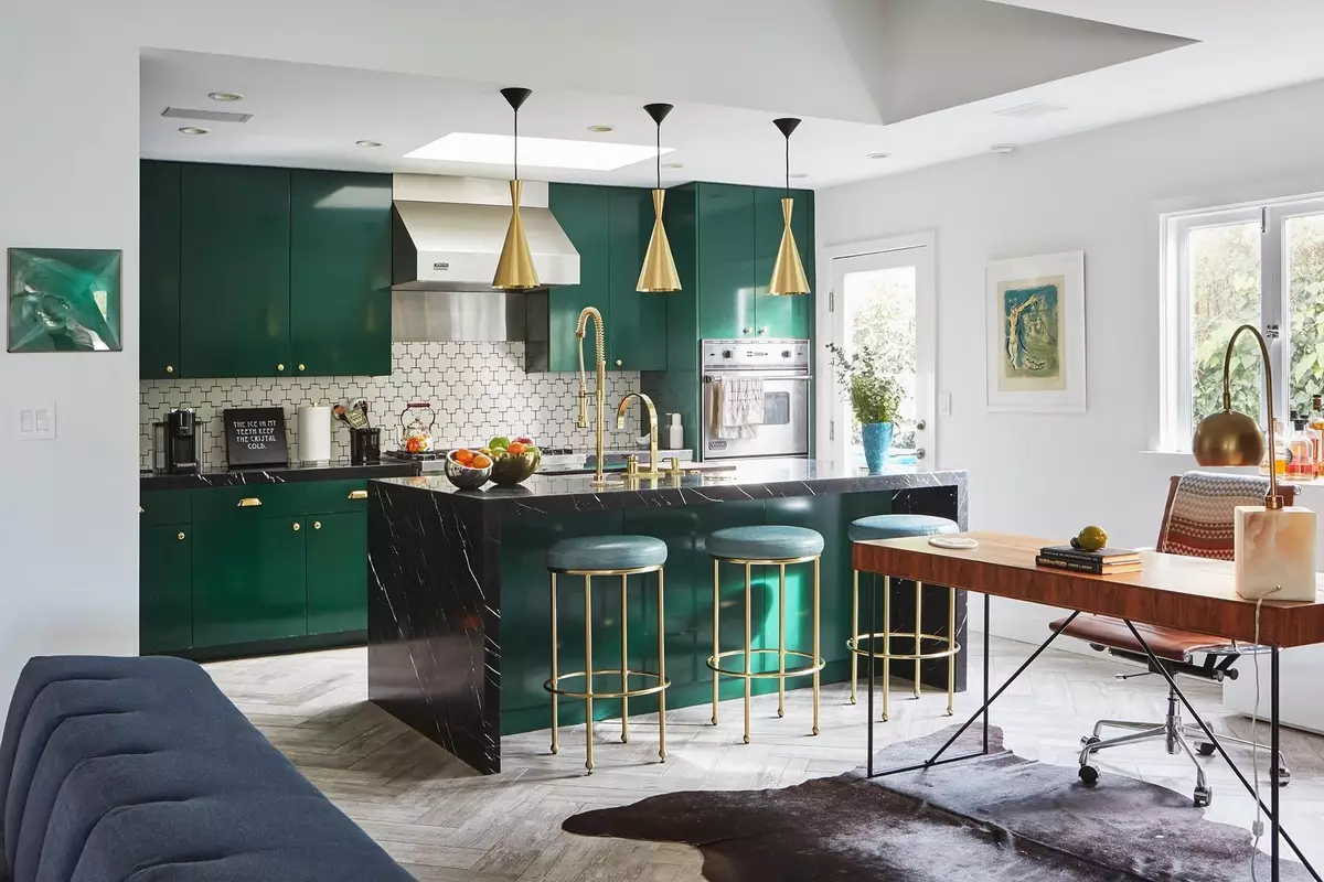
The most successful color combinations with dark green are calm beige shades, light yellow, gray tones. At the same time, the main color must be selected as a calm shade to ensure that the interior does not look too dark.
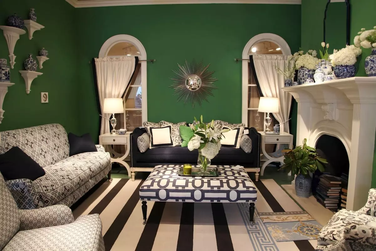
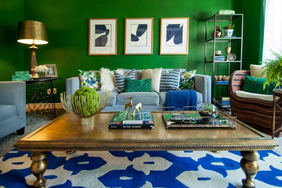
Emerald color
This tint can be called the most mysterious and one of the brightest and unusual in the green palette. It creates an atmosphere of wealth and at the same time adds mysteriousness and unusualness. Emerald color is associated with a green precious stone.
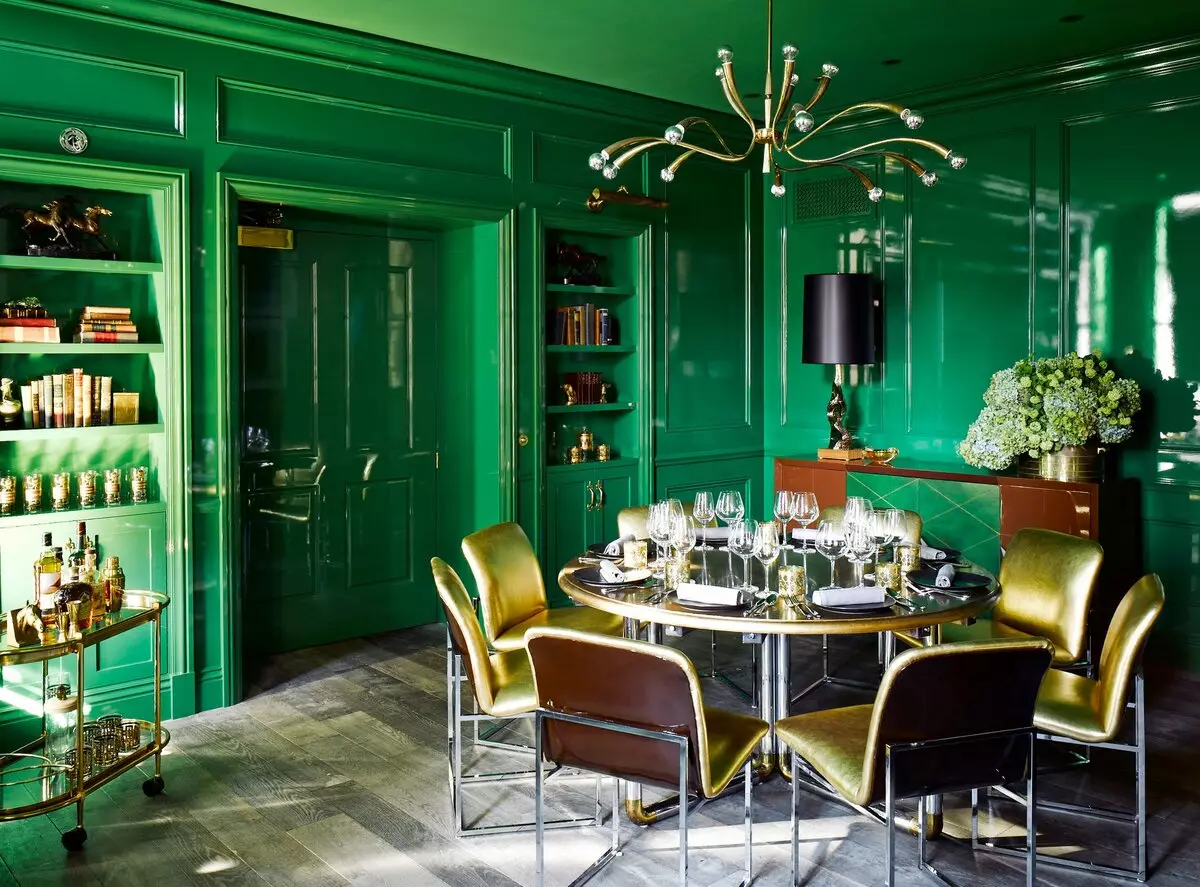
The most advantageously given shade is combined with clean colors - black, brown, gray, white. Interesting is a designer solution to combine it with purple.
So, the emerald is quite self-sufficient color, it is not recommended to overload it with an abundance of prints or details. You can diversify the interior with the help of contrast of textures and color solutions.
Herbal color
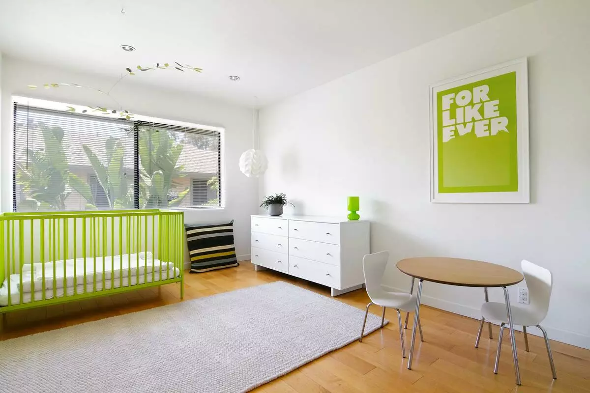
Pure green shade is rarely used in the decoration of residential rooms, so, the natural need for it is satisfied in the summer. A bright green shade will be appropriate in the design of a kitchen, a nursery. In other rooms, he may seem coming and inappropriate.
Article on the topic: How to properly care for furniture from leatherette
Herbal green shade is appropriate for decorating. Green can be interior pillows, dishes, chairs in the kitchen, furniture or kitchen apron. Do not choose green wallpaper or paint as the main interior shade.
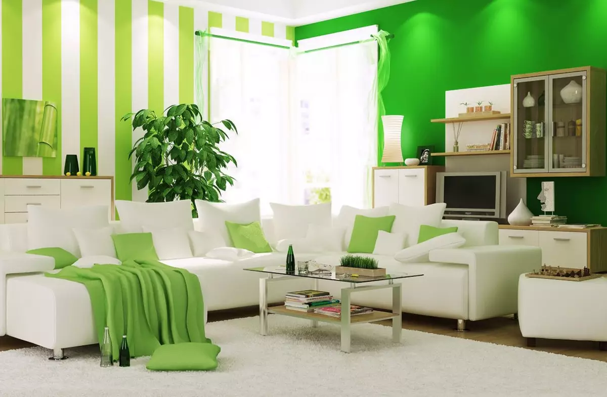
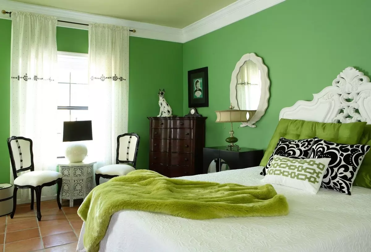
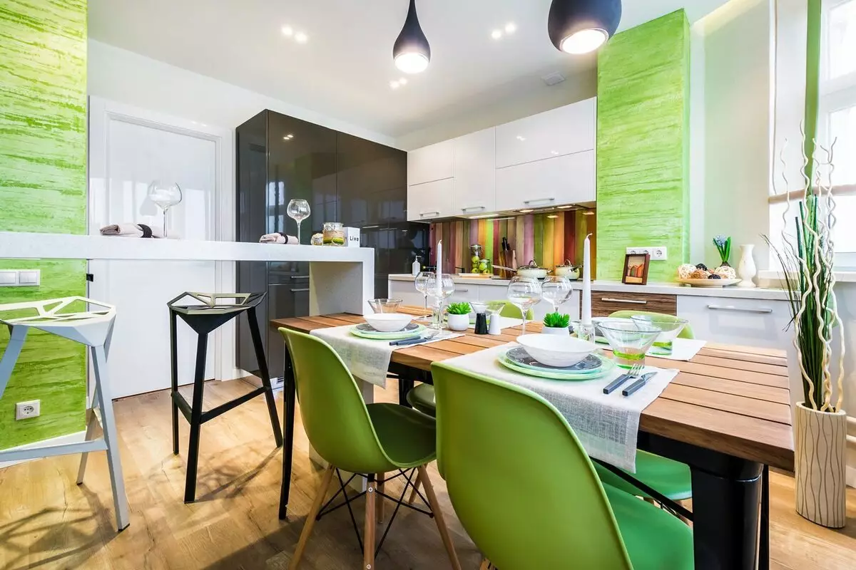
Salad, lime shades
Salad or lime is the most bright of the palette of green shades. They can be used to design any rooms, but are particularly popular for children, kitchens, bathrooms. Excellent combined with complex shades - lavender, mustard, celestial blue. Interesting combinations with dark blue, wood-brown, purple decor elements.
Important! You need to pick up such a shade of salad or linous so that it does not give too much yellow and reminded the walls of the entrance in a high-rise building.
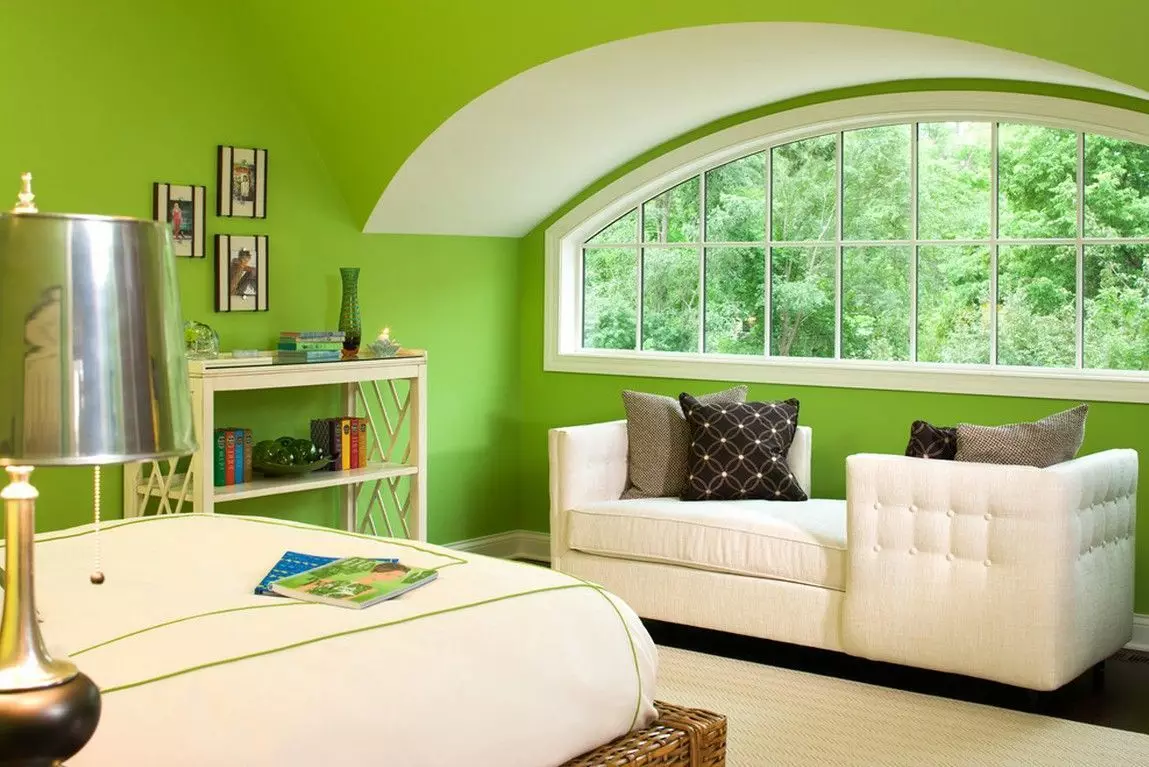
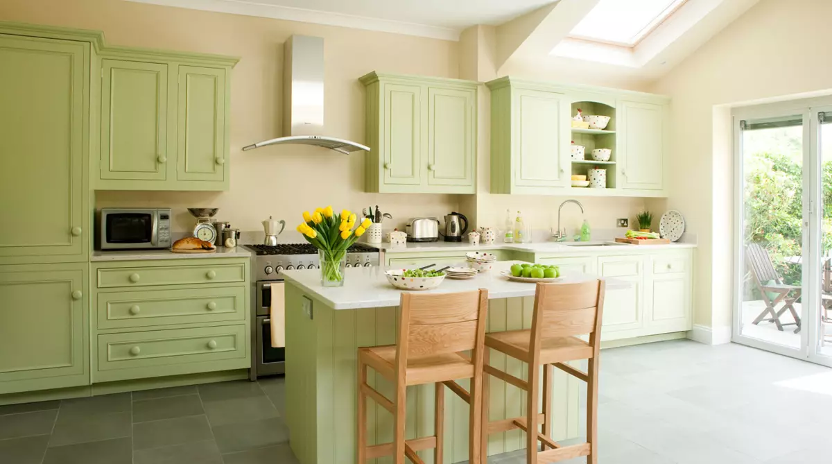
Olive
This color is the most calm and multifunctional, and therefore it is appropriate for the interior design of any room. The shade is complex and multifaceted, it simultaneously resembles a warm summer and brings pleasant associations.
It can be safely chosen as the primary color in any interior. The most successful combinations are variations with white, beige shades, wood, blue colors.
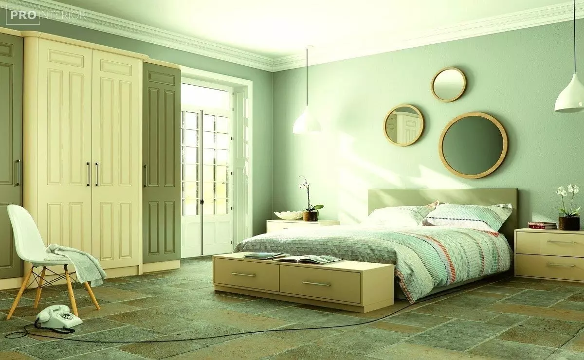
Mint, pistachio shades
These colors are distinguished by freshness, so deservedly popular with the design of kitchens, children's rooms and bathrooms.
It is interesting to mix finishing materials - tiles, fabrics, wallpapers in the interior. Mint and pistachio shades are well combined with blue, mustard, gold, cream shades.
Green in the interior: how to choose the right paint (1 video)
Green in the interior (15 photos)


