Pastel colors are shades of chromatic colors that are obtained when the main color is mixed with white. As a result, the effect of bright, "screaming" paints is muffled, since the light shade of color is perceived differently.
The bright tones of the main colors and their mixtures with each other were called pastel because in the old days, the pastels were called crayons made from powder paints, when painted with light lines.
![[For and mind] Pastel colors: Beauty or boredom](/userfiles/69/1286_1.webp)
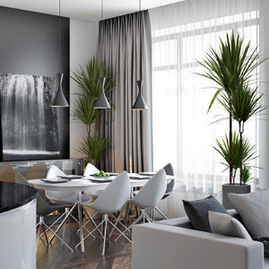
The use of pastel shades in the interior may seem boring. On the other hand, their beauty is tested by time. How to figure out, in what cases, the use of pastel tones will benefit, and in what - it turns out to be superfluous? Let's try to answer this question by weighing "for" and "against".
How to use pastel colors in the design of the premises?
- Pastel colors are suitable for use in rooms where free space is limited. They will visually increase the size of the room.
![[For and mind] Pastel colors: Beauty or boredom](/userfiles/69/1286_2.webp)
- Pastel tones are pleasantly combined with white and light gray, as well as bright items of the same color.
![[For and mind] Pastel colors: Beauty or boredom](/userfiles/69/1286_3.webp)
- They will look at and as the main color indoors, and as a supplement to another shade.
![[For and mind] Pastel colors: Beauty or boredom](/userfiles/69/1286_4.webp)
- When using pastel tones in design, the interior style should be considered. It is not necessary to combine pastel tones with minimalism, it will create the feeling that the room belongs to some kind of state institution.
Pros and Cons Application of pastel tones in the interior of the apartment
Advantages of the design of the room in pastel colors:
- Pastel tones are popular thanks to versatility. The interior performed in bed colors does not strain the nervous system and allows for a long time being indoors. Mute shades help relax. That is why they are used everywhere: from government agencies to school classes.
![[For and mind] Pastel colors: Beauty or boredom](/userfiles/69/1286_5.webp)
- The spectrum of such colors is wide enough. With that, visually enlarge the room can be like a pastel version of pink and green.
![[For and mind] Pastel colors: Beauty or boredom](/userfiles/69/1286_6.webp)
- Various colors of muted shades are much better combined with each other than their bright "counterparts". For example, a combination in the interior of bright red, green and purple will look at least strange. But the connection of pastel-pink, lavender and mint will delight eyes.
![[For and mind] Pastel colors: Beauty or boredom](/userfiles/69/1286_7.webp)
- Combining pastel tones with black color gives interesting results. Against the background of dark shades, they acquire special expressiveness, while not making perception due to excessive brightness. The ratio of black and pastel colors can be safely used in accordance with preferences.
![[For and mind] Pastel colors: Beauty or boredom](/userfiles/69/1286_8.webp)
- Pastel colors look perfectly in a bundle with various reliefs and patterns. Such nuances allow you to create something special.
Article on the topic: New Year in the style of the 90s
![[For and mind] Pastel colors: Beauty or boredom](/userfiles/69/1286_9.webp)
The cons of the use of pastel shades is not so much, but they should be mentioned:
- The need to use in the interior of bright details that will attract attention. Without them decorated in pastel colors, the room will look too nursery.
![[For and mind] Pastel colors: Beauty or boredom](/userfiles/69/1286_10.webp)
- Dirt and dust will be noticeable. The room will require more frequent cleaning, which is not always allowed by the time and strength of the owner.
![[For and mind] Pastel colors: Beauty or boredom](/userfiles/69/1286_11.webp)
- The use of scattered light in the room will become undesirable. Such lighting greatly distorts the perception of space. Directional light sources are the best way out of the situation, since pastel shades will become expressive in the shade.
![[For and mind] Pastel colors: Beauty or boredom](/userfiles/69/1286_12.webp)
Features Color selection for room design
If your room is located on the north side, warm shades are suitable for the interior: sand, pink, peach.
![[For and mind] Pastel colors: Beauty or boredom](/userfiles/69/1286_13.webp)
For the decor of spacious rooms in the southern part of the house, turquoise, blue, mint, gray shades are suitable.
![[For and mind] Pastel colors: Beauty or boredom](/userfiles/69/1286_14.webp)
Pastel tones in the interior (1 video)
Using pastel colors in the interior (14 photos)
![[For and mind] Pastel colors: Beauty or boredom](/userfiles/69/1286_15.webp "[For and mind] Pastel colors: Beauty or boredom")
![[For and mind] Pastel colors: Beauty or boredom](/userfiles/69/1286_16.webp "[For and mind] Pastel colors: Beauty or boredom")
![[For and mind] Pastel colors: Beauty or boredom](/userfiles/69/1286_17.webp "[For and mind] Pastel colors: Beauty or boredom")
![[For and mind] Pastel colors: Beauty or boredom](/userfiles/69/1286_18.webp "[For and mind] Pastel colors: Beauty or boredom")
![[For and mind] Pastel colors: Beauty or boredom](/userfiles/69/1286_19.webp "[For and mind] Pastel colors: Beauty or boredom")
![[For and mind] Pastel colors: Beauty or boredom](/userfiles/69/1286_20.webp "[For and mind] Pastel colors: Beauty or boredom")
![[For and mind] Pastel colors: Beauty or boredom](/userfiles/69/1286_21.webp "[For and mind] Pastel colors: Beauty or boredom")
![[For and mind] Pastel colors: Beauty or boredom](/userfiles/69/1286_22.webp "[For and mind] Pastel colors: Beauty or boredom")
![[For and mind] Pastel colors: Beauty or boredom](/userfiles/69/1286_23.webp "[For and mind] Pastel colors: Beauty or boredom")
![[For and mind] Pastel colors: Beauty or boredom](/userfiles/69/1286_24.webp "[For and mind] Pastel colors: Beauty or boredom")
![[For and mind] Pastel colors: Beauty or boredom](/userfiles/69/1286_25.webp "[For and mind] Pastel colors: Beauty or boredom")
![[For and mind] Pastel colors: Beauty or boredom](/userfiles/69/1286_26.webp "[For and mind] Pastel colors: Beauty or boredom")
![[For and mind] Pastel colors: Beauty or boredom](/userfiles/69/1286_27.webp "[For and mind] Pastel colors: Beauty or boredom")
![[For and mind] Pastel colors: Beauty or boredom](/userfiles/69/1286_28.webp "[For and mind] Pastel colors: Beauty or boredom")