The constant dynamics in life does not pass without a trace, and it is not surprising that after a while of an excessive active life, a person begins to strive for equilibrium, bringing some relevant elements to its interior. Many designers recommend accessing mint color. Since this tint is relaxing. Moreover, it is relevant, first of all, for urban residents.
Dominant gamma
Psychologists say: if you need to get inner and physical relaxation in such premises, like a children's room, a kitchen and a bedroom, use light green shades in their design.

A widely used tendency is widespread in the interior of calm, relaxing shades that help effectively recover after an energetic work day and remove fatigue from the eyes. And the wallpaper can be helped in the best way here.
Color perception
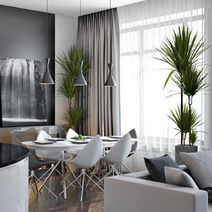
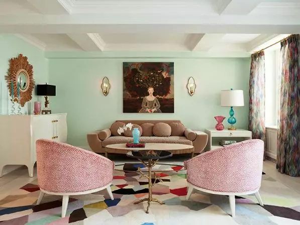
Excellent example of using attractive color combinations in design
This tone itself occupies the average position between Salatov and Blue. In some cases, designers even say that it is a light green tone, which is diluted with heavenly blue at a large concentration. The intensity depends on the degree of saturation of blue paint.
If there is little blue in it, then the tonality is obtained saturated and easier. Well, if you add a large amount of blue, then the mint will give a greater cool, and will become less saturated. It unites several different shades at once: Pang, Aquamarine, and others.

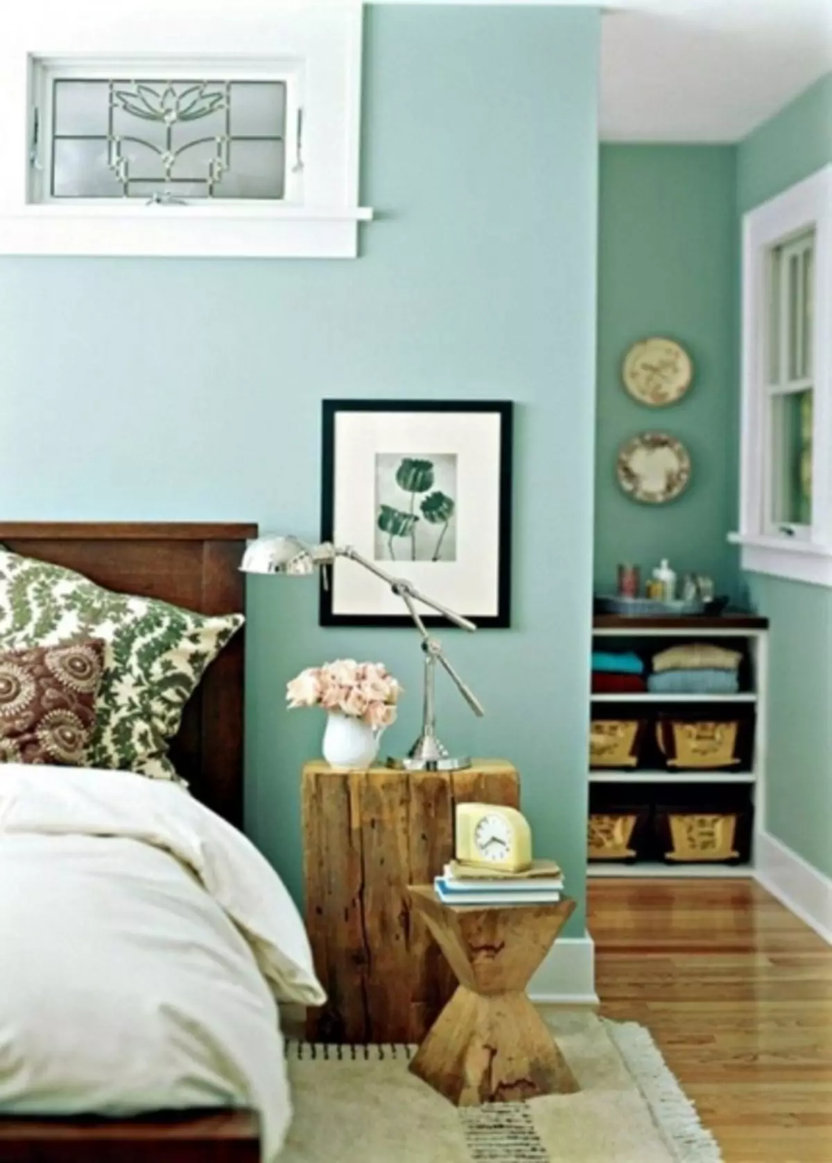
Successful combination of wallpaper and with furniture contrasting
Mint is one of the shades of green, and the blue paint is actively diluted. The degree of saturation of this tone depends on the concentration in it of the blue tone. To a greater extent, it is a pastel tone with a refreshing effect.

In addition, this shade is attributed to the effect of pacification, since a person feels as safe as possible in the room with the walls of such a tone. And therefore, the wallpaper of the mint can be seen usually in those rooms that are inherent in the increased activity, some nervousness (kindergarten, office, hospital, etc.). Such walls, especially in unobtrusive and harmonious patterns, are ideal for perception by the human eye, and therefore it can be used on the surfaces of any area.
Article on the topic: How not to view the floor to eliminate the creaking of the wooden floor in the apartment
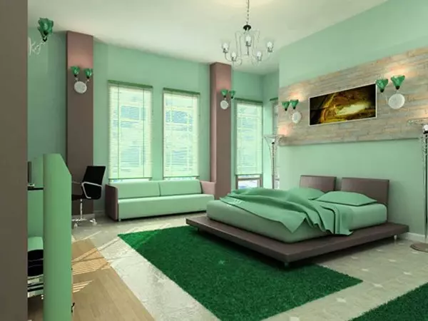
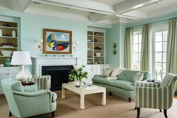
Use of mint color in wallpaper and interior
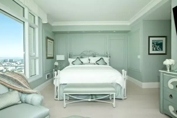
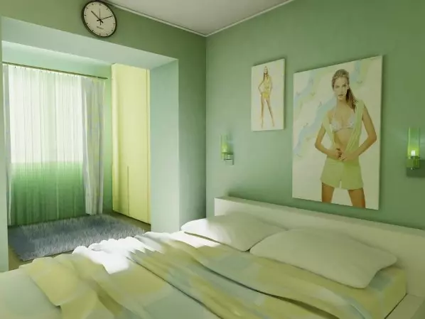
Photo: bedroom soothing mood
You can use such a palette in many rooms, and it can act as a secondary tone and manifest itself in separate details and accents, and maybe the main one. In this case, it is performed in the premises background. Regardless of the degree of significance, this background brings a spring mood and comfort to any interior.
You can use similar paints when creating any style. If the mint is more faded and faded, then it perfectly emphasizes the identity of any retro style: vintage, shebbie chic and a number of others.
In this case, the optimal neighbor will be:
- cream or light pink;
- turquoise;
- chocolate;
- light blue.

More than a fresh mint shade in combination with a classic white kel and its gray-handed options will greatly emphasize the minimalist style. At the same time, light tonality will expand the space and add freshness and softness into it.

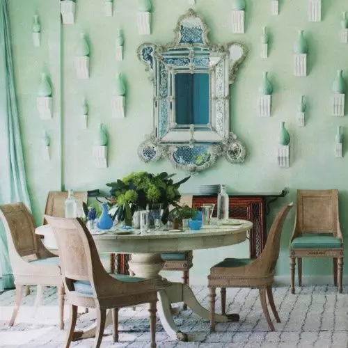
Different options for palette
If there is a desire to use the wallpaper of a mint color in the kitchen, the optimal combination for them will be the shade of wood. Moreover, this background can be both glossy and matte. It is not necessary to bypass it and when creating a cozy children's room. It is a similar color that creates a cheerful mood, does not irritate the eye, has joyful associations.
If, for example, the room is created for a girl, a light lilac or pink tone can perform in a harmonious combination. Well, for the boy's room, mint color can be combined with turquoise, blue or apricot tint. Also relevant mint wallpaper and in the interior of the bedroom.
Curtains and curtains should be bright, preferably white or pastel tones
Popular combinations

We give examples of various color combinations that can be used in the interior design of apartments:
- Thin accents - it is possible to use such a background without increasing strong attention. These can only be small, but sophisticated accents that are placed in the interior at their discretion.
- Strong accents - lovers of this tone should be used in the design bold palette, with saturated and dark shades. Well, to make the perception of the tonality more active, it can be combined with blue or green paint.
- Fresh metallic - an incredibly pure sense of the union can be obtained during a combination of mint and metal surfaces. This is especially important for the kitchen space, where the combination with the metal will become appropriate.
- Bright combinations - mixing the wallpaper of a mint color with a bright, summer caller, creating, literally, exciting style. The simplest but efficient combination with coral. But, choosing a bright neighbor, you need to make sure that you complement each other, and not compete. Best of all on large mint spaces to use small bright accents.
Article on the topic: How to repair the dimmer do it yourself?

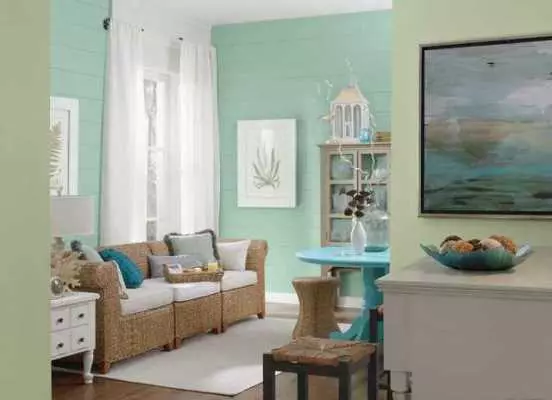
Photo: entourage, which has a friendly conversation
In addition, the attractive result can give the following color combinations:
- White - gives the design purity and clarity. The mint wallpaper can be added with white carpeted, furniture and curtains. But it should be limited to using such combining of paints only in the bedroom or in the bathroom;
- Black is a more relevant modern combination that gives the background even greater coolness. You can use the combination of black and mint in the bedroom, living room, as well as in the bathroom. For balancing, you can use a mirror, a picture in a black frame or stylish black wall clock;
- Yellow-brown - light, warm composition, which will be quite appropriate in everyday style. Yellow-brown gamut can be used for carpet, curtains, upholstered furniture;
- Lavender tone - he also refers to pastel colors and contributes to creating a soothing atmosphere. It is recommended to resort to this color alliance when designing bedrooms and kitchens. In such relaxing interiors, bright accessories and decor will not interfere;
- The color of the sea wave is the combination of shades inherent in retro style, and it is best to arrange a children's room, a kitchen and a dining room. If a similar alliance of different options for palette is used in the design of the living room, then the accents of black and red.