The most important and completion step in the design of the design of the room is the choice of color scheme and its distribution over the elements of the interior. Color has an impact on how a person perceives the room and refers to it, and also conducts the correction of space, allows you to visually increase or reduce its quantity, omit or lift the ceiling, "disguise" massive setting components. The main task here is to choose a competent set of colors, because not every combination and not in any situation can look good. One of the most common types of color gamut is two colors that can be contrasting and opposed.
"Monochrome" option
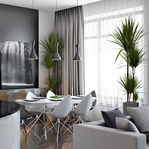
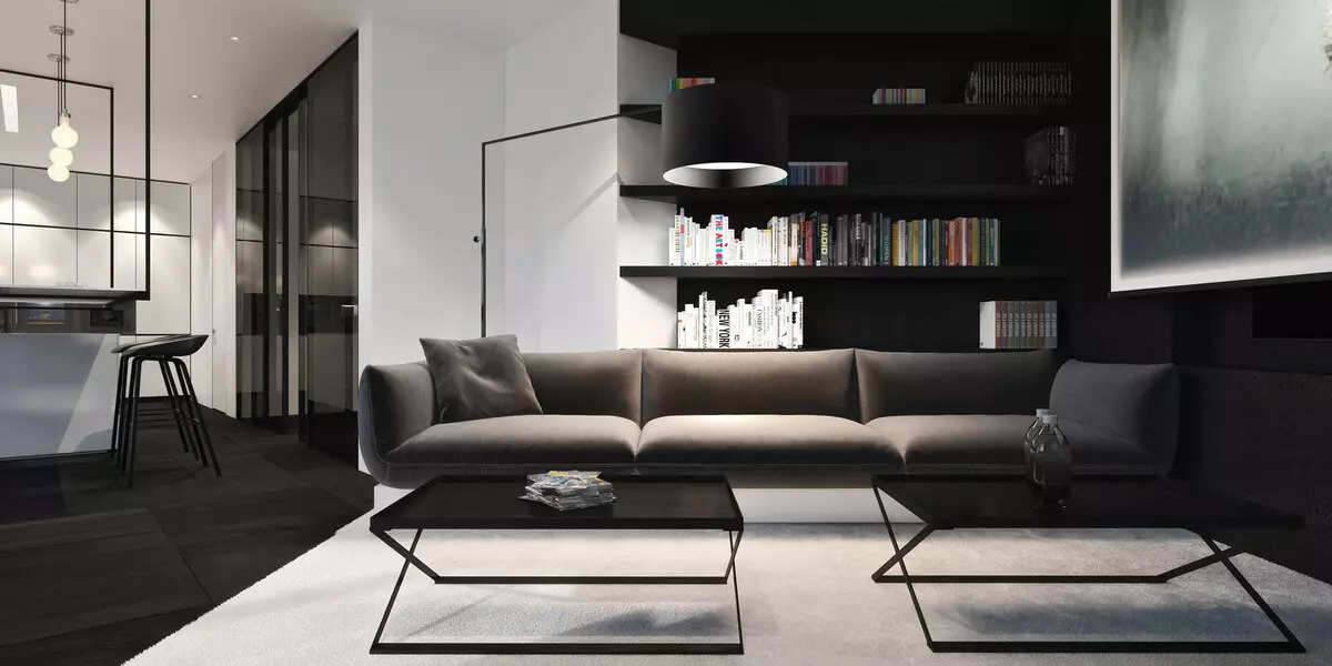
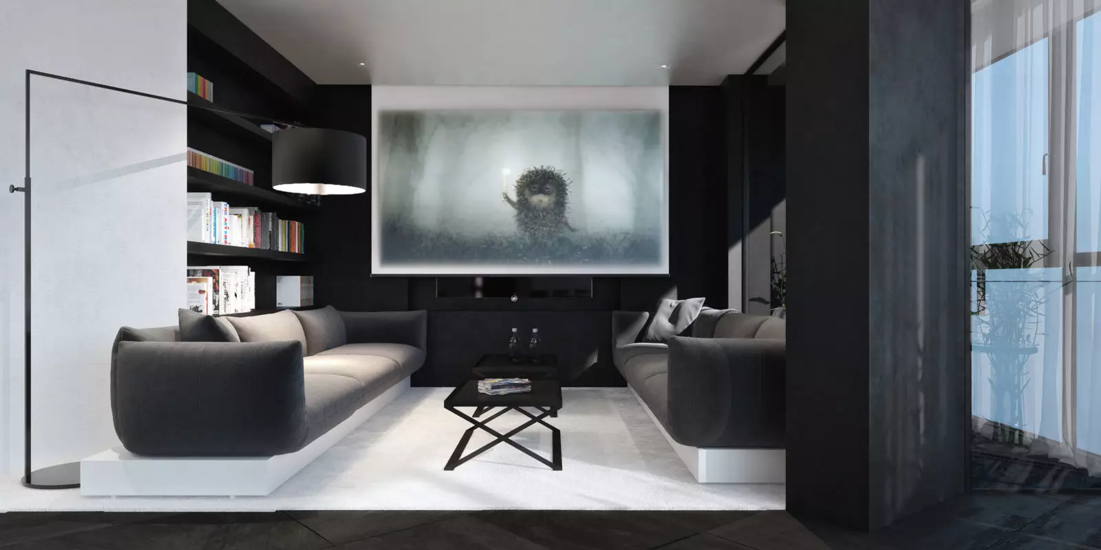
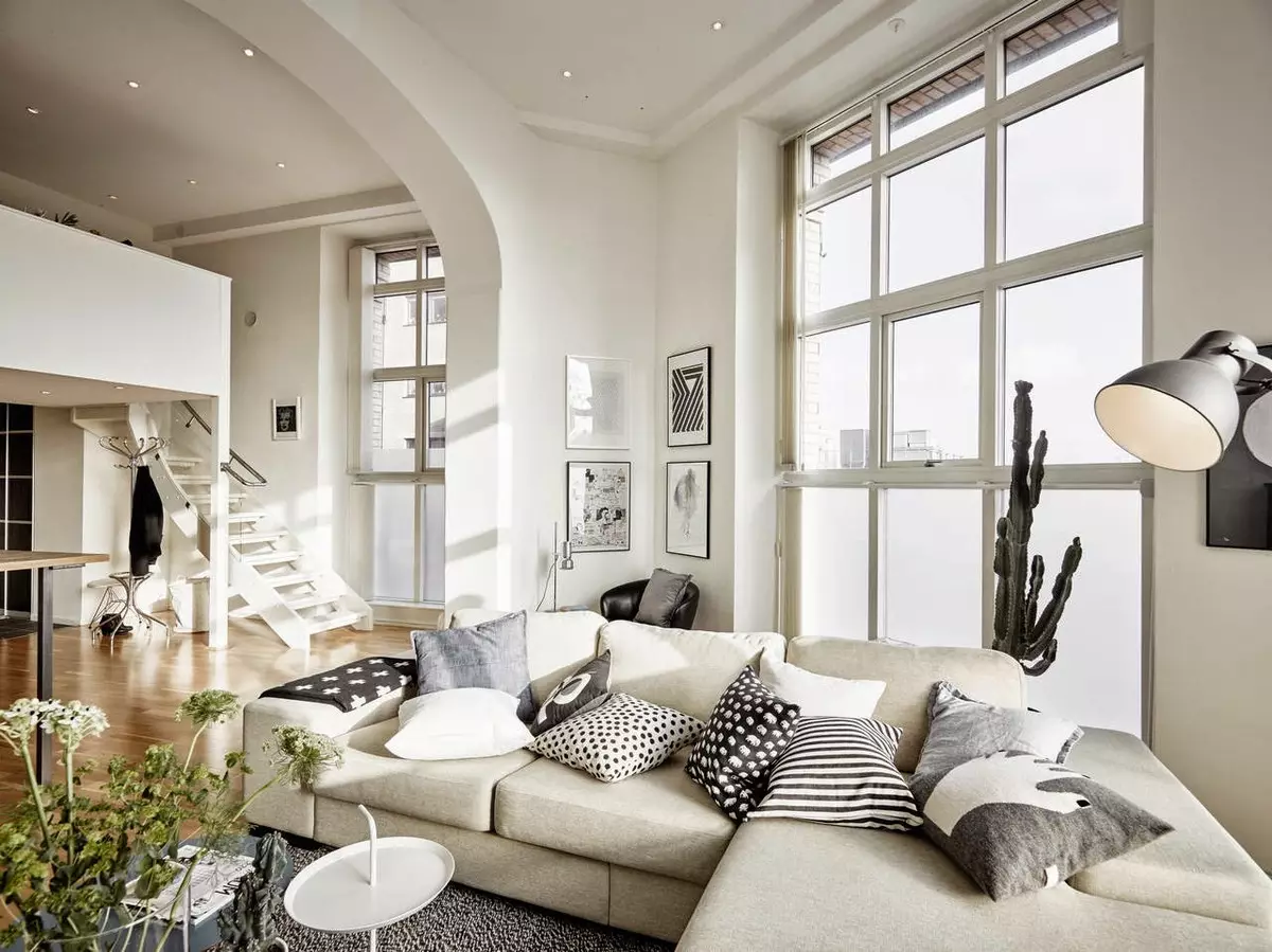
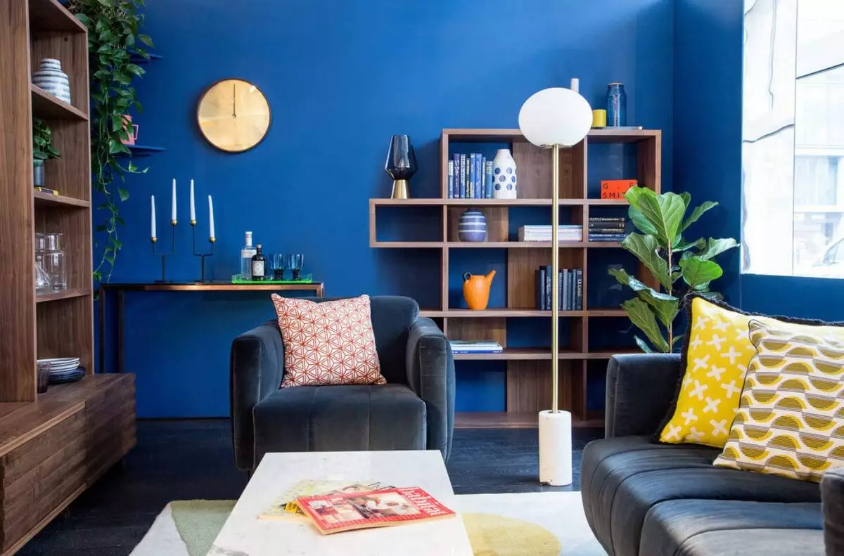
The basic approach is to select colors from a relatively close range or even shades of one color. The best color harmony is achieved by using the so-called. "Achromatic colors", that is, colors belonging to white, black and mixtures thereof in various proportions. However, not colorless combinations of two colors close on the spectrum can be suitable, let's say cream and beige or brown and dark orange.
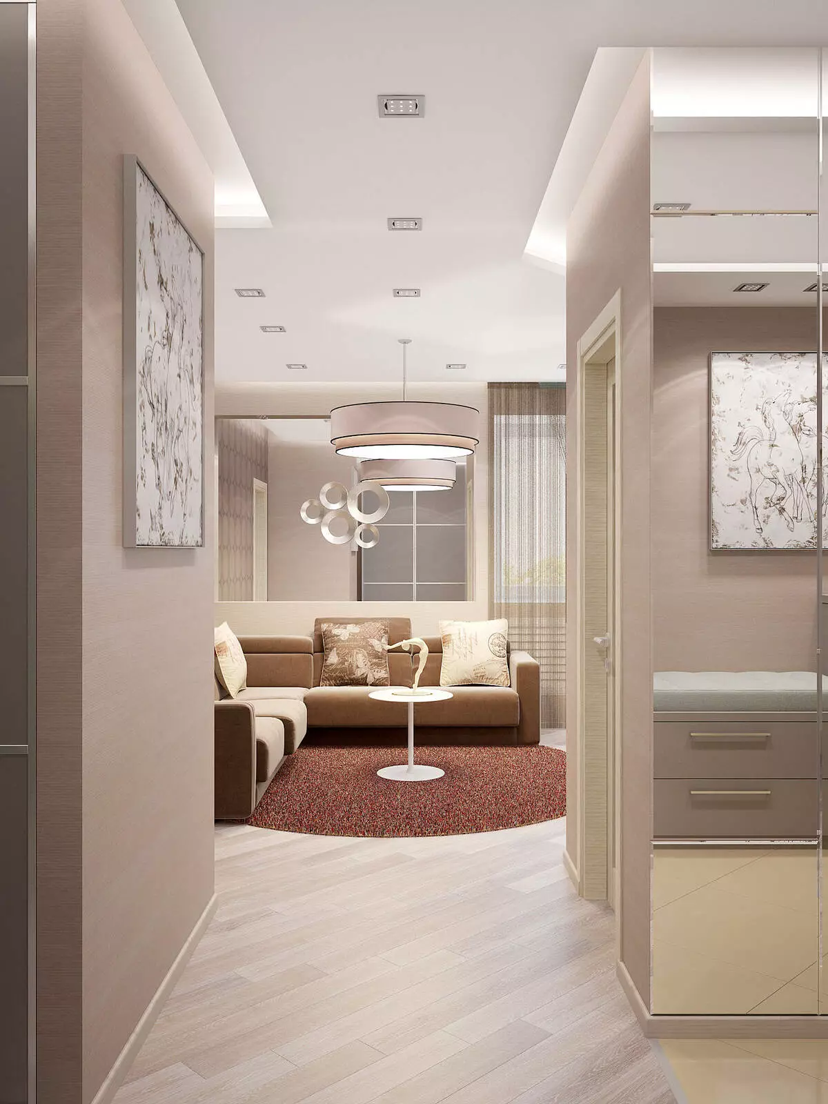
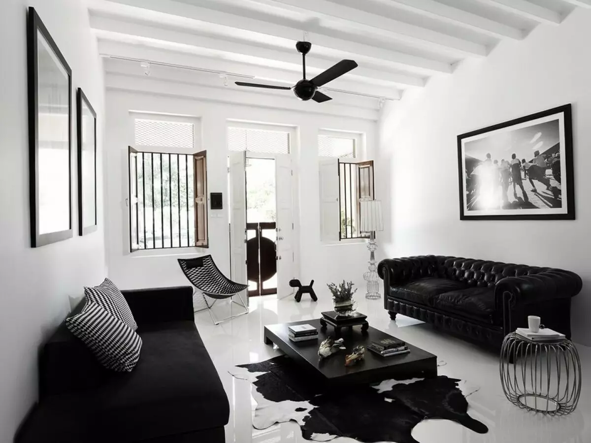
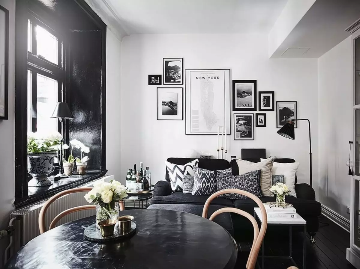
Such a combination may seem faded and neuropric, so it is necessary to approach its use with caution. As a rule, monochrome colors are used in design not "face" rooms, i.e. Corridors, toilets, baths and restrooms.
A variant of the polar spectrum
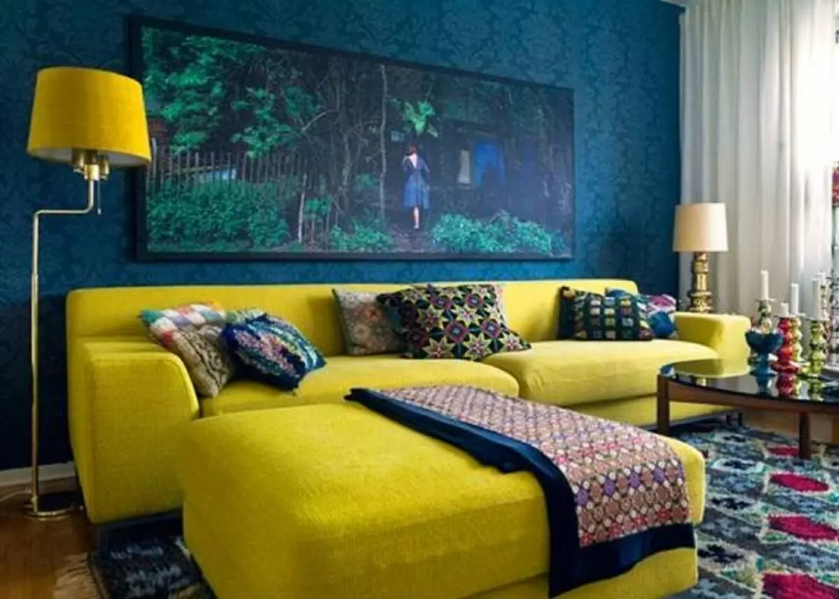
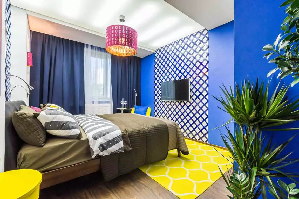
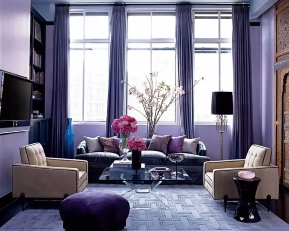
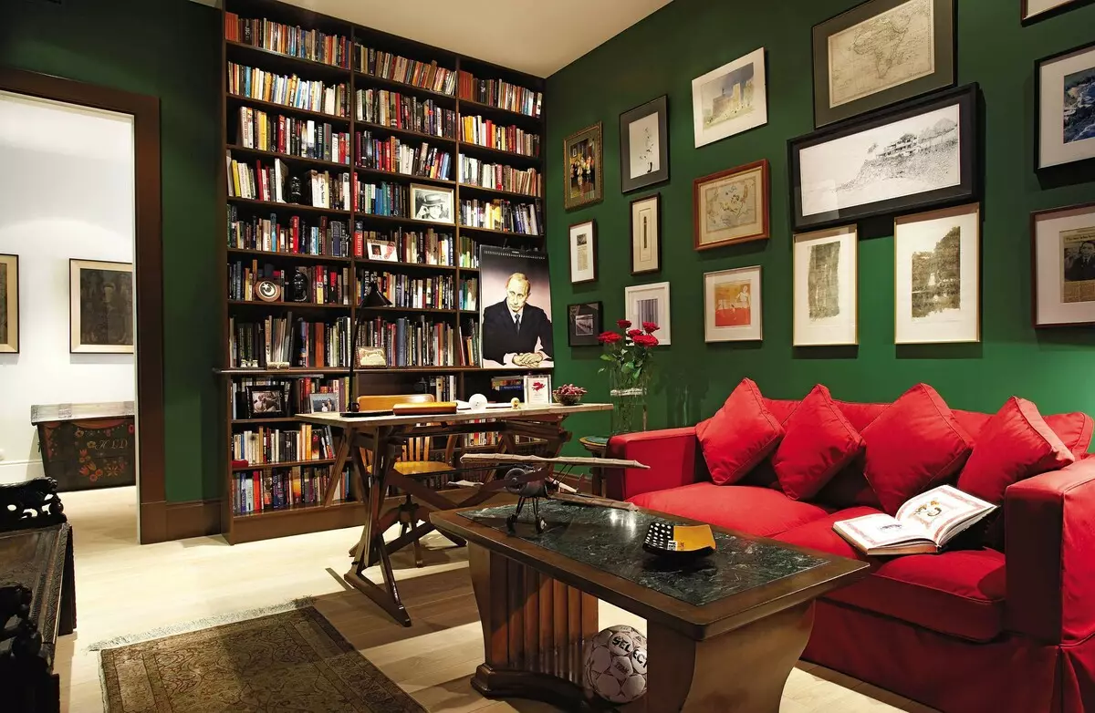
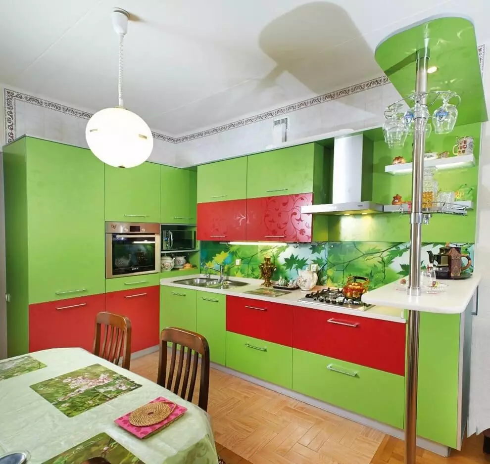
It is to use two diametrically opposite colors as herbal and purple, blue and color of a mahogany. Such pairs of flowers are called contrasting and are located against each other in the color circle. The sum of such two colors is perceived by the human eye several times stronger, which means the price of an error during a non-compatible combination is rising at times, from a too contrasting picture in humans even may appear headache and fatigue in the eyes. Therefore, the choice of polar shades should be more careful and attentive than monochrome. It is worth split every color into several categories, between which the connection must be unambiguous, both by the number of categories and their spectral distribution.
Article on the topic: What to do with an empty wall: 5 stylish design options
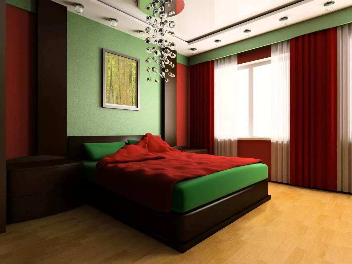
Let one of the colors be dominated and dosed, and the second - suppressed and smeared across several shades, varied by the parameters light / dark and brightness / purity. It is necessary to strive for the ratio of 70 to 30 by the number of space occupied.