The priority colors of the interior are not stable, there is a constant change of shades and preferences. Designers for a long time stopped the choice on beige and gray brown colors, white and color of khaki. The combination and beating of various directions and styles easily managed with neutral tones. Last time, gray color is gaining popularity, which is suitable for minimalistic design, classic, modern and others. Supporters of gray in design have small secrets that everyone needs to know to everyone so that the apartment becomes cozy and modern.
Important: Gray, depending on the shade, is warm or cold. Based on this, the design of the room in the selected color range should be followed.
The advantages of gray in the interior
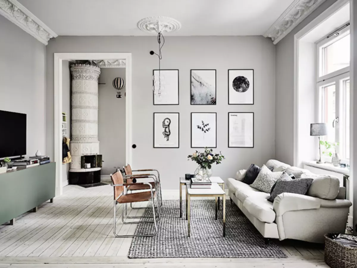
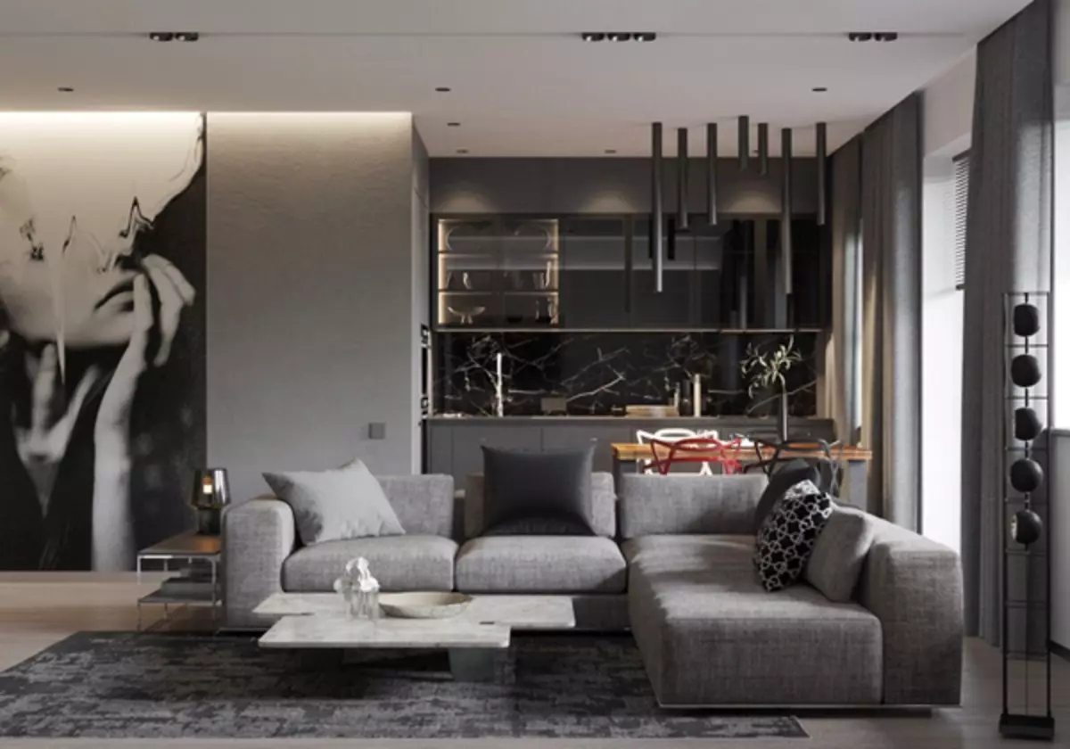
Thanks to light gray tones, a background is created, on which each piece of interior becomes noticeable and is highlighted, there is space for bold solutions and experiments.
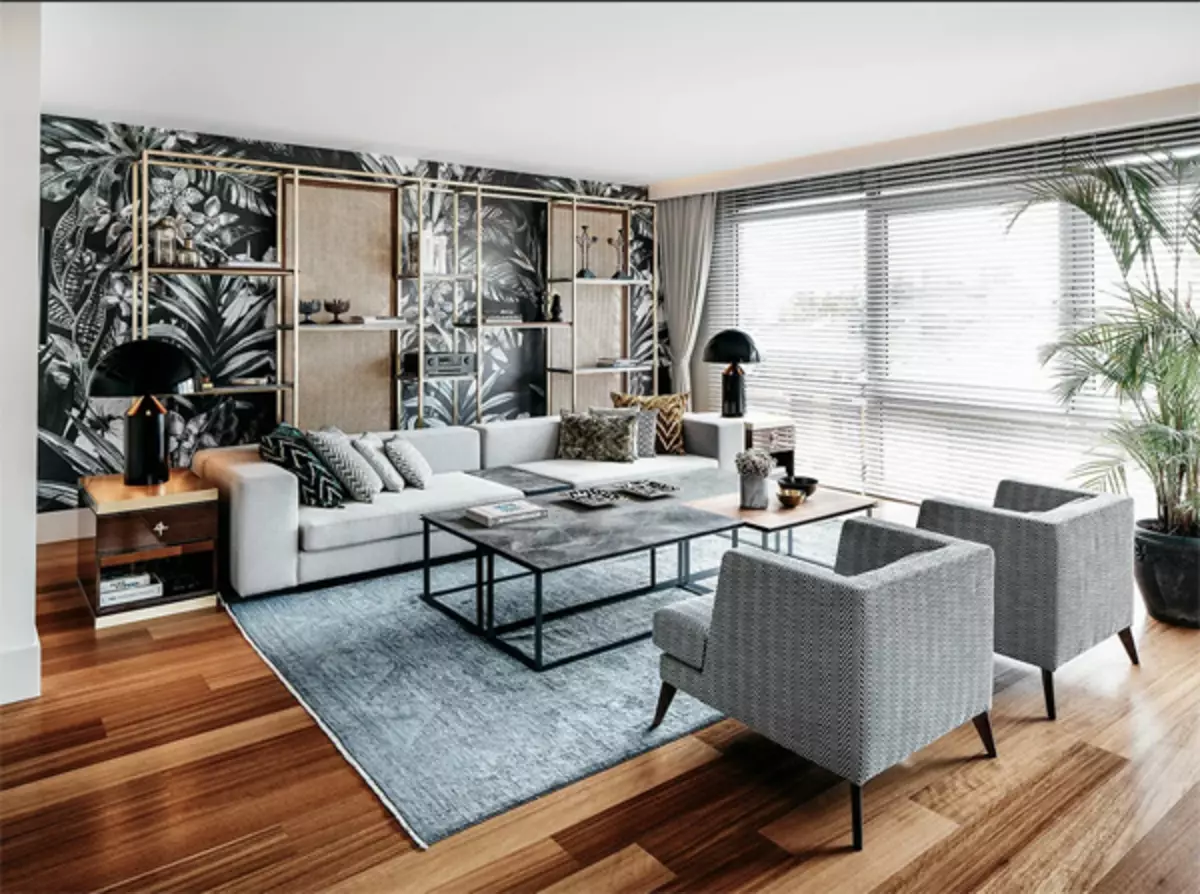
Shades of gray become a link between furniture, drapering and other elements of the decor, without creating sharp transitions.
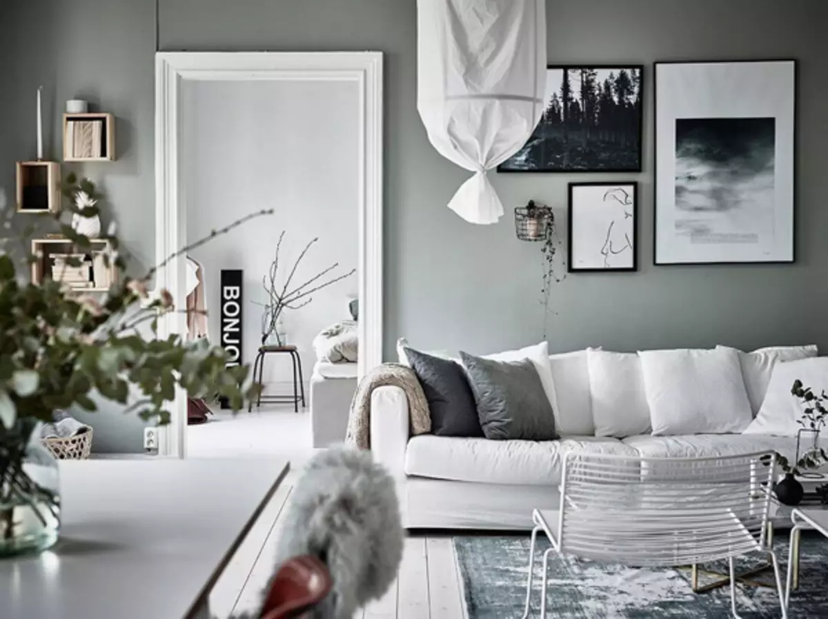
It helps to relax after work, creates a cozy and relaxed atmosphere, has a beneficial effect on his eyes.
Supplemented by pink or lavender shades, creates a harmonious mood, helps to relax in the bedroom, does not distract from calm thoughts.
The bright walls in the nursery serve as a background for bright furniture, carpets or paintings, remove the excitement.
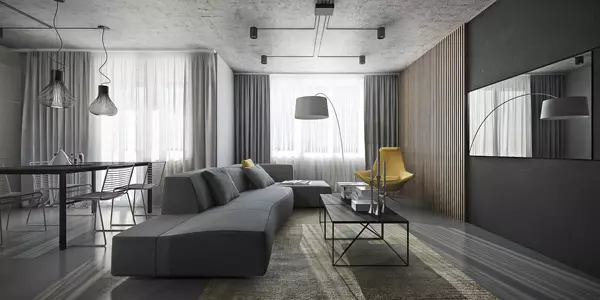
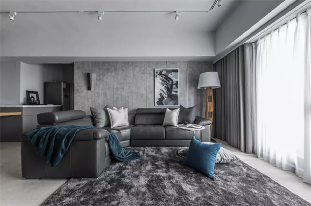
In the working office, cold shades set up to work, help to focus on solving important issues.
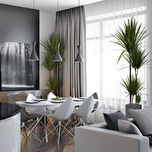
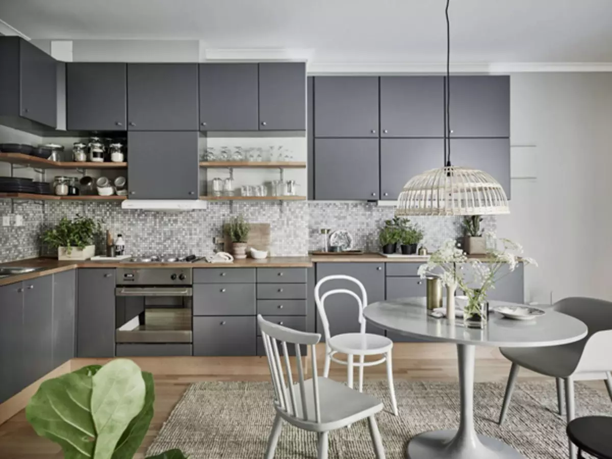
Cold gray, complemented by chrome decor, red or white elements - it looks in the kitchen, especially in the modern style.
Gray is combined with any color, suitable for Scandinavian and classic styles. High-tech and minimalist solutions are not better played in strict and rich shades, diluted with a glitter metal and chrome inserts.
Article on the topic: All "For" and "against" panoramic windows
Negative effect of gray in the interior
With caution to the choice of cold tones in the interior, it is worth considering people with depressive inclination, unsure of their own. Cold color scheme, if the wrong choice is able to increase the longing and loneliness, lead to stress. It is important to avoid the feeling of gloomy and godic space. The solution in the addition of heat and coziness is a lot of bright light from the windows or from the lamps.
Important: Dark gray visually reduces the room, so it does not fit for small rooms.
Combines with other shades of colors in the interior
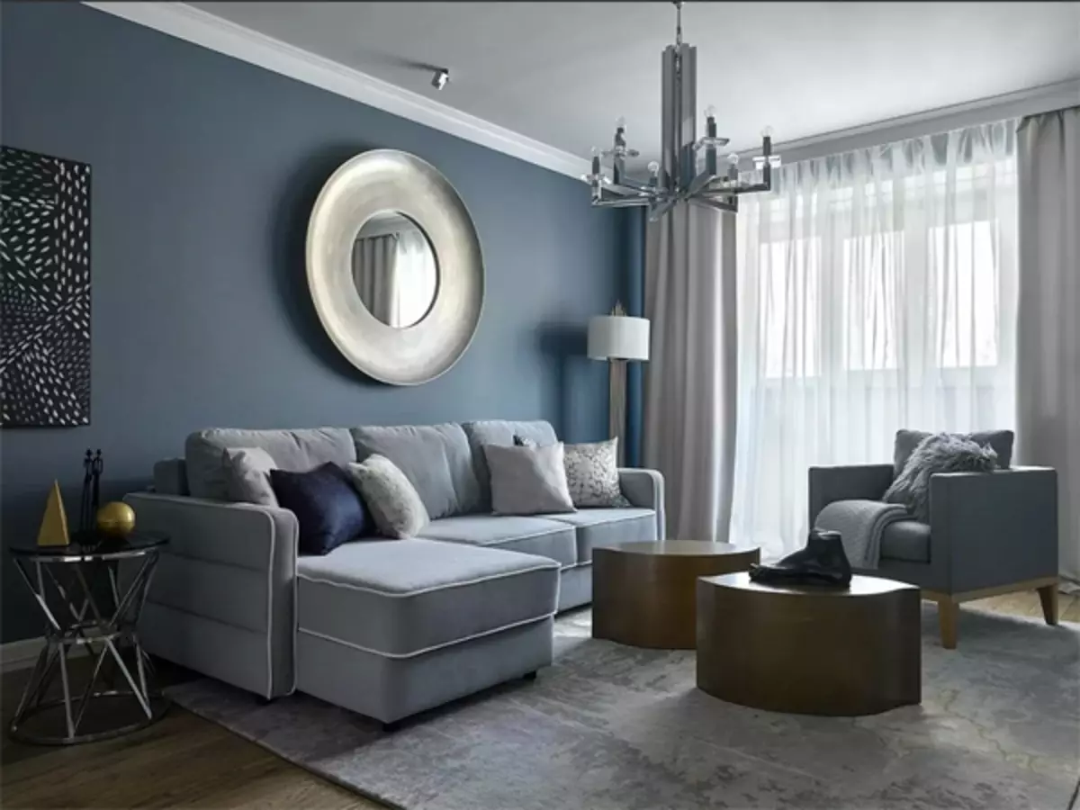
The gray-blue tone on the walls will emphasize the cold white furniture and the severity of the interior.
A room that goes on the sun, filled with light, will look good in the warm colors.
The north side, on the contrary, looks effectively in cold colors, but necessarily complemented by artificial lighting.
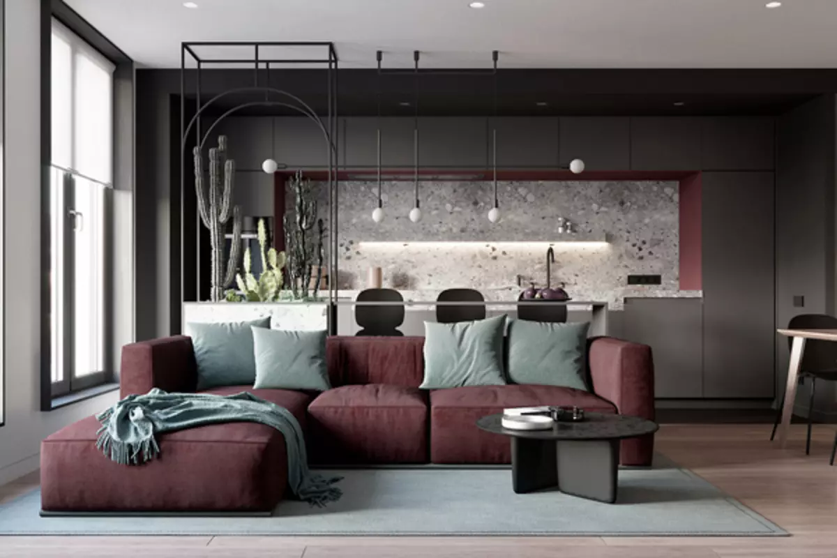
Despite the fact that gray is combined with all colors, it is not necessary to get involved in mixing contrasting colors. Add pink, lilac, blue, mint or other shade should be carefully so that the dominant remains all the same gray. Otherwise, the cakes will be outstanding the base color that combines with everything.
Blue shades of gray with light gray belong to the classic and are often used by designers for the background. Furniture and decor elements, on the contrary, can be bright and screaming, which does not spoil the impression.
The effect on the color perception is light: natural lighting, chandeliers, lamps. Experimenting with the brightness of light, the color of the plafoons and the beams can be easily changed with the shade of the interior, affect the mood.
For a long time, it was the opinion that the gray is a robust and boring mouse color, which is choosing uncertain people. But, as time shows, this is noble color, the choice on which they stop confident and self-sufficient people, seeking harmony. This is an exquisite solidity and a bold decision not only in clothing, but also in the interior, as evidenced by the popularity of the Fashion.