Fashion for "pink glamor" did not leave with the "zero years" and Russian novels. The color of the Barbie doll called Fuchsia over time began to be re-associated with stupidity and vulgar infantality, but he had more gentle, pastel shades on shift.
![How to use pink shades to be stylish? [Trends 2019]](/userfiles/69/1212_1.webp)
What shades pink today in trend
In the most relevant style of this season, Ar-Deco did not cost without delicate, powdered and pastel shades of pink:
- pale pink;
- cream-pink;
- shrimp;
- Royal pink;
- amarantine;
- dark pink;
- pink sunset;
- ashes roses;
- Light lilac.
![How to use pink shades to be stylish? [Trends 2019]](/userfiles/69/1212_2.webp)
Shades are not saturated with color, they are light and fresh, modest and noble. All trend shades pink are a mixture with white, cream, dairy, lilac, or gray tone. From auxiliary color depends on the heat of pink shade. For example, creamy pink is a warm shade, which is perfect for the walls in the nursery or in the bedroom. Royal Pink is a noble cold tone, in which the walls of the living room or a coating of upholstered furniture are designing.
![How to use pink shades to be stylish? [Trends 2019]](/userfiles/69/1212_3.webp)
Where pink color is appropriate to whom it is suitable and who do not like
In the bedroom of newlyweds pink is appropriate in warm light colors on bedding, textiles, pillows, in small details of the interior. The muffled beige-pink with a pearl sampling is a warm shade emitting homemade comfort. This year it is fashionable to use as the primary color for the bedroom.
![How to use pink shades to be stylish? [Trends 2019]](/userfiles/69/1212_4.webp)
![How to use pink shades to be stylish? [Trends 2019]](/userfiles/69/1212_5.webp)
The maiden room is a whole universe with its inner world. About 11 years old, Girls wake up "Pink Dreamy" about beautiful princes and evil dragons. Bed linen, curtains, fluffy pillows - All this can be decorated in powder colors with a mandatory impact of warm pink tone. Basic color can act cream, white or beige.
Article on the topic: How to choose a bunk bed in a nursery?
![How to use pink shades to be stylish? [Trends 2019]](/userfiles/69/1212_6.webp)
Pale pink with warm subtock perfectly combined with a cheerful pistachio tint of a young greenery. Contrast green splashes of indoor plants, curtains, pillows on the background of the walls of a warm shade will turn the room in a fresh and cheerful space.
![How to use pink shades to be stylish? [Trends 2019]](/userfiles/69/1212_7.webp)
In 2019, elegant and extravagant furniture elements were returned to fashion, such as: chairs with figured backs and armrests, a brocked or velvet surface of which is made in a cold shade "dust rose". Modern and extravagantly fit into the lounge pouf with a dark pink velvet coating.
![How to use pink shades to be stylish? [Trends 2019]](/userfiles/69/1212_8.webp)
In pink tones, work offices, offices and "male" territory are not design. After a long stay in the "pink zone" men annoy and cannot focus on important things.
![How to use pink shades to be stylish? [Trends 2019]](/userfiles/69/1212_9.webp)
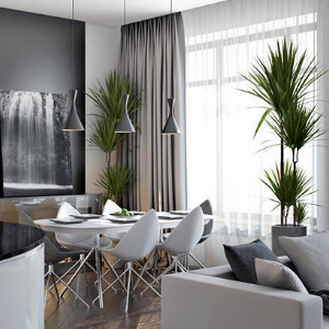
Combine pink shade with other flowers, their distribution in the interior
- Saturated Pink (Fuchsia) / Black - Such a contrast is akin to the hysterical scene in the middle of a white day. He carries a psyche and impotence at the same time. The combination is not appropriate for classic and traditional interior styles.
![How to use pink shades to be stylish? [Trends 2019]](/userfiles/69/1212_10.webp)
![How to use pink shades to be stylish? [Trends 2019]](/userfiles/69/1212_11.webp)
- Milk gray / dust rose - By muffling the pink and black tone and gradually come to a noble combination: a dairy-gray and cold light pink shade. White color acquires a greater contrast, and pink, on the contrary, absorbs itself silver gleam.
![How to use pink shades to be stylish? [Trends 2019]](/userfiles/69/1212_12.webp)
- Cream / Siren Pink - Noble combination of restrained and gentle shades. The muted lilac pink is appropriate for wallpapers with gray floral ornament. The cream shade is used as an additional shade: it is present in curtains, pastel underwear, ornamental pillows, in furniture elements.
![How to use pink shades to be stylish? [Trends 2019]](/userfiles/69/1212_13.webp)
Pastel and powdered pink wallpaper shades are capable of expanding the space, create an optical illusion of higher ceilings. The sofa or chair contrasting with a darker interior will also seem more than they really are.
![How to use pink shades to be stylish? [Trends 2019]](/userfiles/69/1212_14.webp)
Interior Design: Stylish Pink (1 video)
Use of pink shades in the interior 2019 (14 photos)
![How to use pink shades to be stylish? [Trends 2019]](/userfiles/69/1212_15.webp "How to use pink shades to be stylish? [Trends 2019]")
![How to use pink shades to be stylish? [Trends 2019]](/userfiles/69/1212_16.webp "How to use pink shades to be stylish? [Trends 2019]")
![How to use pink shades to be stylish? [Trends 2019]](/userfiles/69/1212_17.webp "How to use pink shades to be stylish? [Trends 2019]")
![How to use pink shades to be stylish? [Trends 2019]](/userfiles/69/1212_18.webp "How to use pink shades to be stylish? [Trends 2019]")
![How to use pink shades to be stylish? [Trends 2019]](/userfiles/69/1212_19.webp "How to use pink shades to be stylish? [Trends 2019]")
![How to use pink shades to be stylish? [Trends 2019]](/userfiles/69/1212_20.webp "How to use pink shades to be stylish? [Trends 2019]")
![How to use pink shades to be stylish? [Trends 2019]](/userfiles/69/1212_21.webp "How to use pink shades to be stylish? [Trends 2019]")
![How to use pink shades to be stylish? [Trends 2019]](/userfiles/69/1212_22.webp "How to use pink shades to be stylish? [Trends 2019]")
![How to use pink shades to be stylish? [Trends 2019]](/userfiles/69/1212_23.webp "How to use pink shades to be stylish? [Trends 2019]")
![How to use pink shades to be stylish? [Trends 2019]](/userfiles/69/1212_24.webp "How to use pink shades to be stylish? [Trends 2019]")
![How to use pink shades to be stylish? [Trends 2019]](/userfiles/69/1212_25.webp "How to use pink shades to be stylish? [Trends 2019]")
![How to use pink shades to be stylish? [Trends 2019]](/userfiles/69/1212_26.webp "How to use pink shades to be stylish? [Trends 2019]")
![How to use pink shades to be stylish? [Trends 2019]](/userfiles/69/1212_27.webp "How to use pink shades to be stylish? [Trends 2019]")
![How to use pink shades to be stylish? [Trends 2019]](/userfiles/69/1212_28.webp "How to use pink shades to be stylish? [Trends 2019]")