Planning the interior of the room, with special attention to choosing a color palette. According to psychologists, it is the color that leaves the imprint on the emotional state of the person. It is important to choose a harmonious color palette. Only the correct combination of colors will help create a pleasant interior. To make all manipulations correctly, you need to read the information that will be shown below.
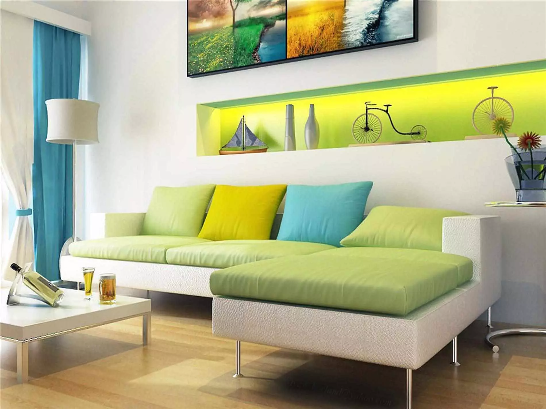
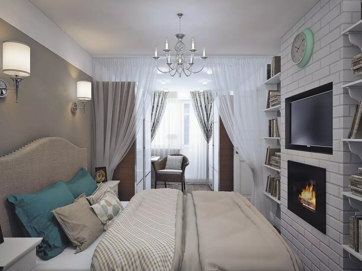
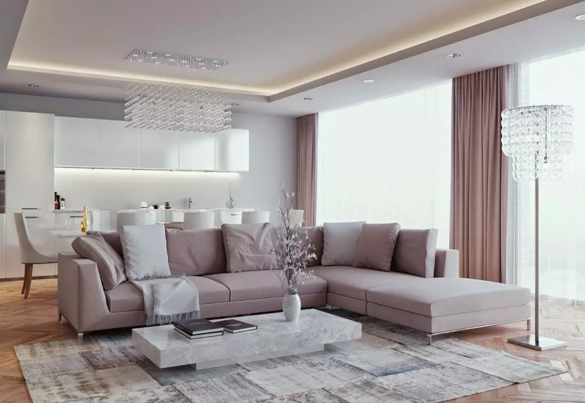
The color palette chosen for the room does not include more than 4 colors. Otherwise, according to the result, there is a feeling of chaos, it is hard in such a room even from a psychological point of view. The choice of active and passive colors depends on the purpose of the room. For example, pastel shades should be active for the bedroom.
The main rules of the combination
Choosing a color palette, guided solely with its taste preferences not enough, pay attention to certain rules.
Basic rules, choice of color palette:
- Choose one fundamental color, best, if it is neutral;
- When combining the color palette, the nuances of compatibility of warm and cold shades are taken into account;
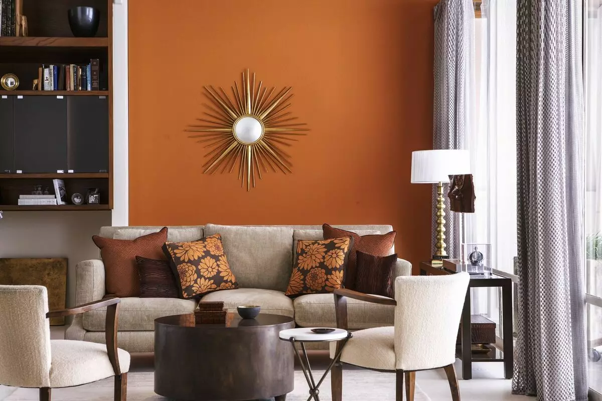
- In the big room it is better to use a warm color palette, it will give the room of a special coziness;
- You can increase the small space with a cold color palette;
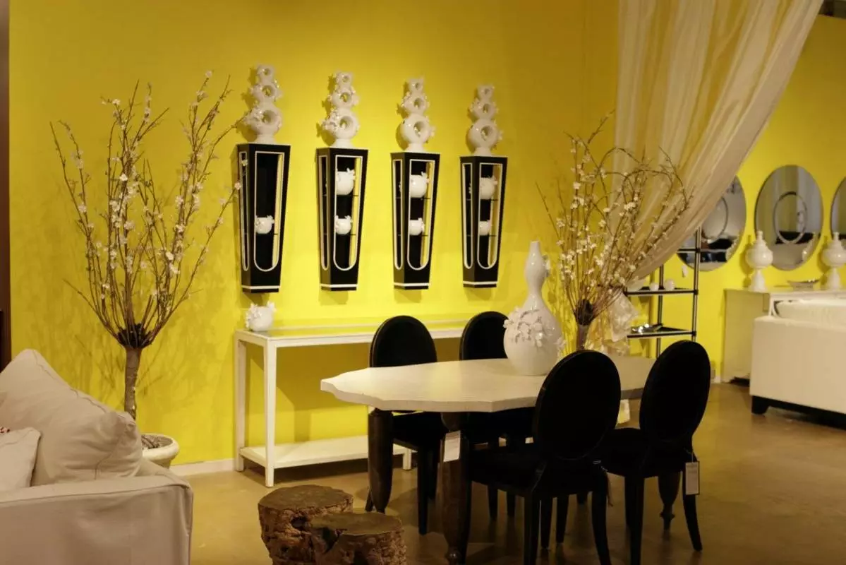
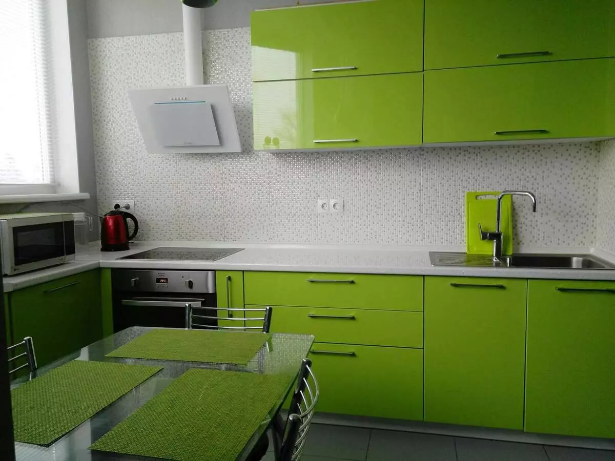
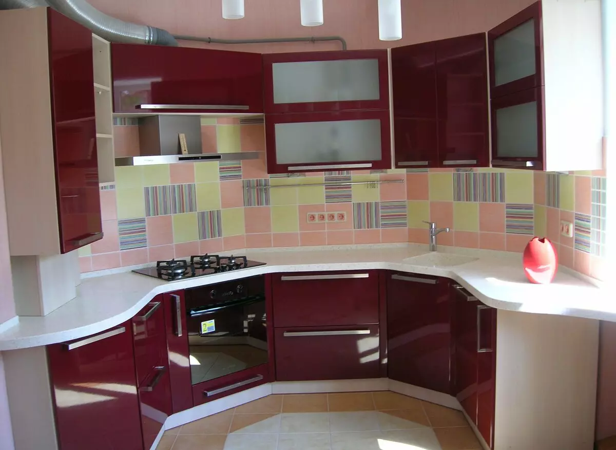
- Choosing a color for the kitchen, take into account the recommendations of psychologists. Some colors increase the appetite, and others contribute to the rejection of food;
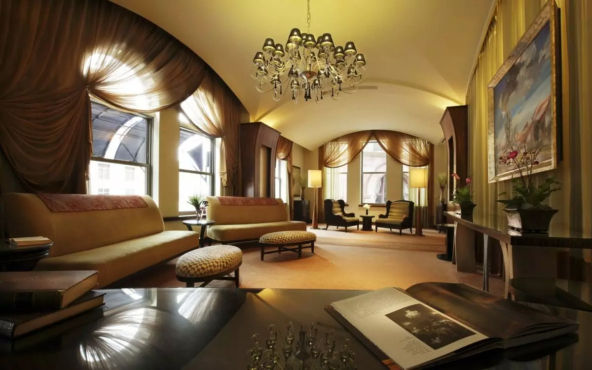
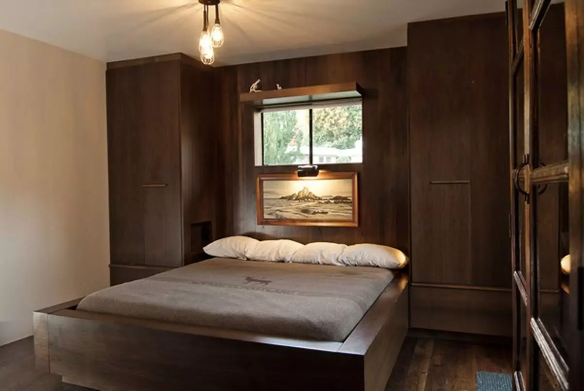
- The color palette of the bedroom should contribute to a moral and physical rest;
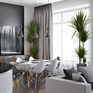
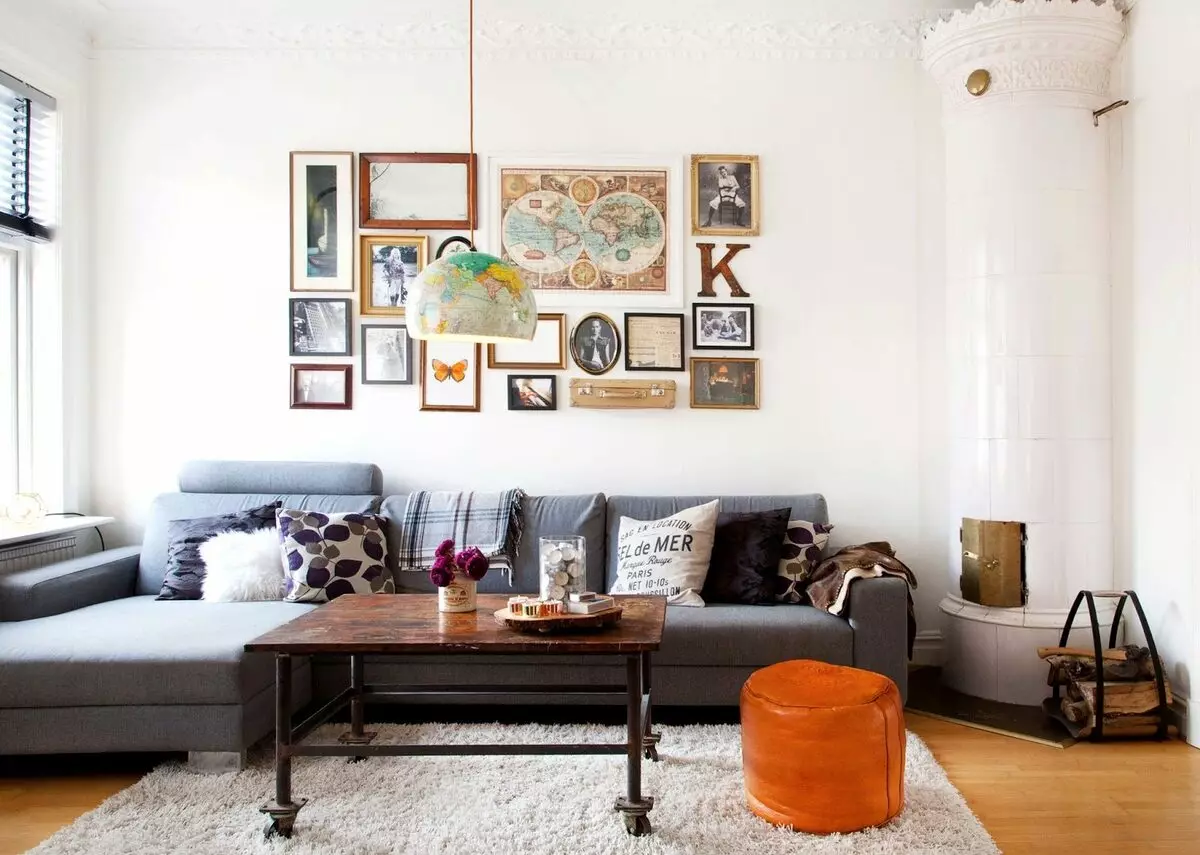
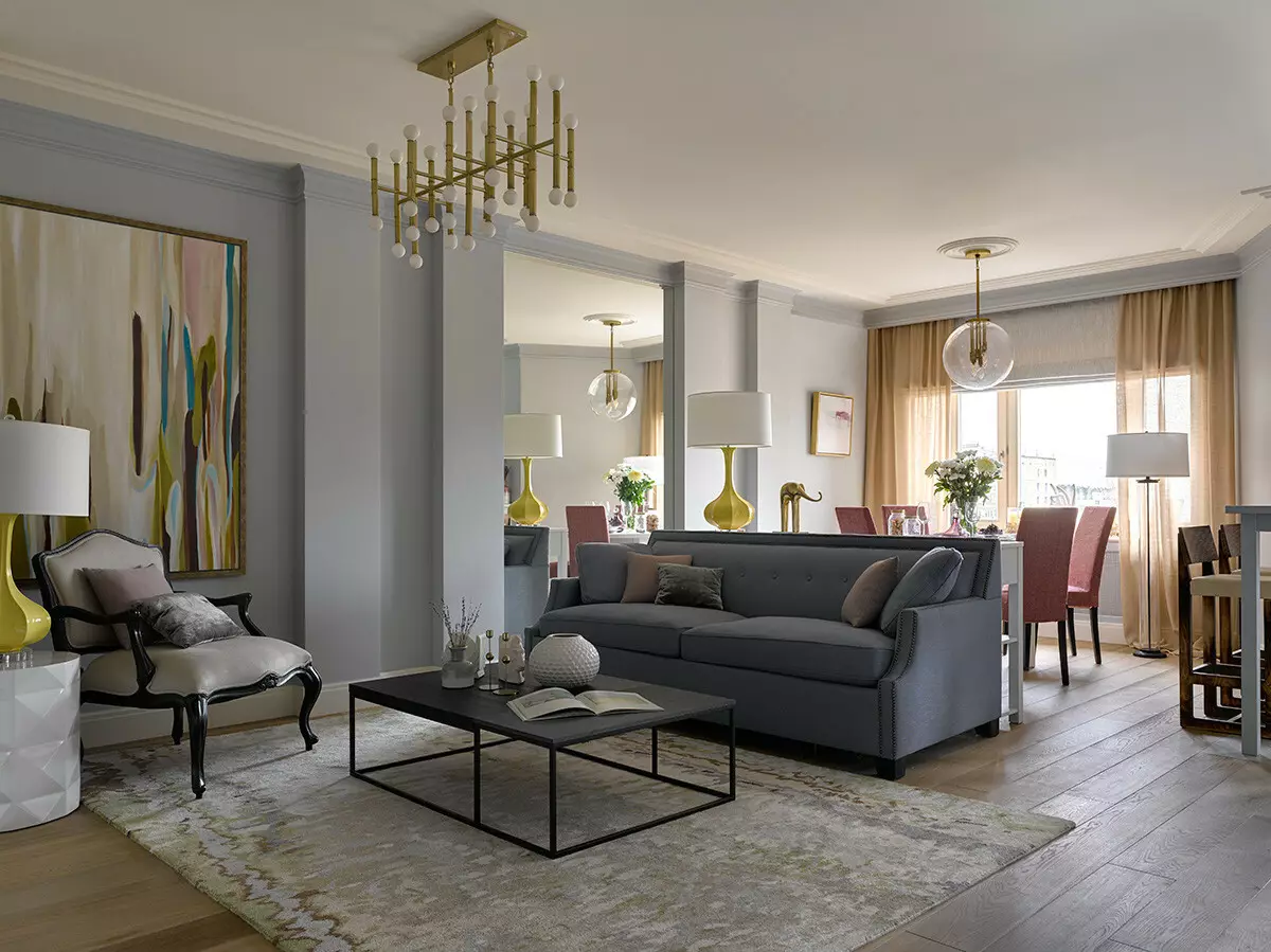
- The living room should be framed in a neutral color palette, as guests should also feel comfortable.
To begin with, it is worth choosing a stylistic direction. This will help choose from specific color solutions.
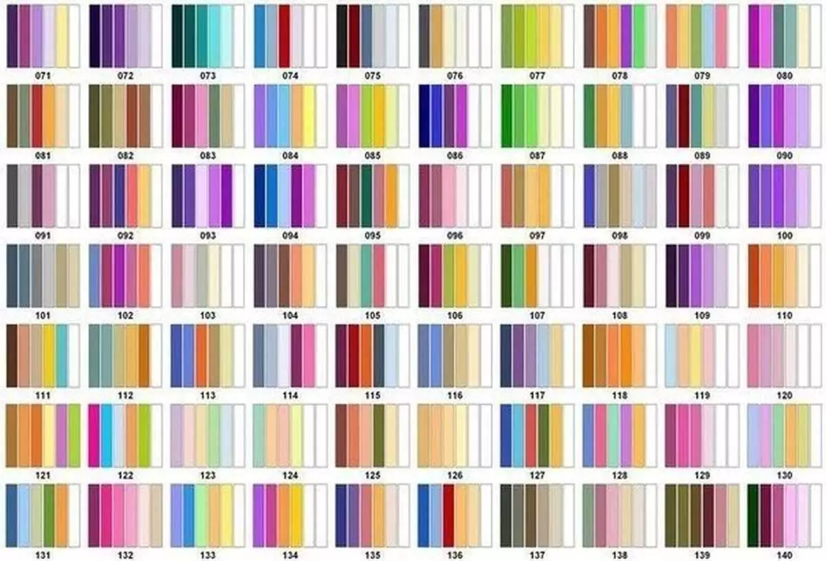
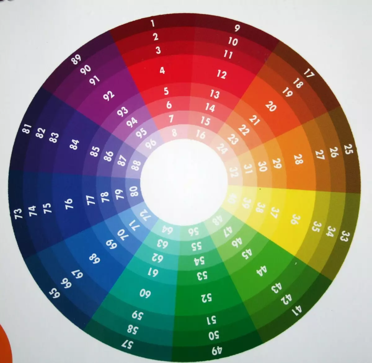
Circular combination of flowers
In order to independently pick up successful colors, it is worth using a special combination of colors. It is represented by the twelve sectors. In each individual sector, all separate shades of a particular color are collected. The circle will help you choose the combination even in the most difficult cases.
Article on the topic: 5 Main errors when using booho style
You can also use special tables in which you can find all possible combinations. Designers recommend using three colors for design. One, of which should be active, that is, saturated. The remaining two colors act as complementary.