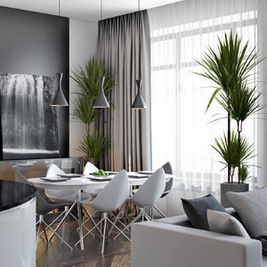
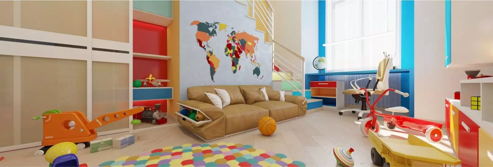
Recently, more and more young artists apply bright color palettes in their works, which were at the peak of popularity in the 80s of the twentieth century. It was at that time that the use of bright color mixes was a sign of a good taste.
Rehabilitation of very undeservedly forgotten colorBlocks and gradient chords are engaged in masters of painting and color printing. In one installation, three different colors are perfectly combined, with the addition of a brilliant surface of a purple shade, emerald green glasses or gold, with its quiet radiance - are signs that designers gradually taste the aesthetic features of the 1980s. Not left aside and architecture, which "supports" this flow. This is evidenced by all sorts of buildings that have frozen, and sometimes at all insurgent colors. Pavilions of the shades of peach or roses, the villa of heavenly blue color, a variety of shades buildings, more reminiscent of turmeric. Further Pierre Cardin stepped. His palace of bubbles, painted in pink tones and put up for sale, became a trigger, which caused the boom of architecture of all sorts of shades. This attracted special attention to the global press and a huge number of users of popular social networks.



Article on the topic: Crall Marx forever?
